From R to interactive charts and maps
It is possible to make online, interactive charts and maps directly from R/RStudio, thanks to a group of R packages collectively known as htmlwidgets.
These packages take instructions in R code, and write the JavaScript and HTML necessary to make charts using popular JavaScript visualization libraries. They also allow you to easily export the charts that you create in R as responsively designed web pages, which can be embedded in other projects through simple iframes.
This means you can work in a single environment to both process data and make online charts. Maintaining a simple, streamlined workflow makes it easier to produce graphics quickly on news deadlines.
The data we will use
Download the data for this session from here, unzip the folder and place it on your desktop. It contains the following files:
food_stamps.csvUS Department of Agriculture data on the number of participants, in millions, and costs, in $ billions, of the federal Supplemental Nutrition Assistance Program from 1969 to 2016, as used previously.disease_democ.csvData illustrating a controversial theory suggesting that the emergence of democratic political systems has depended largely on nations having low rates of infectious disease, as used previously.kindergarten.csvData from the California Department of Public Health, documenting enrollment and the number of children with complete immunizations at entry into kindergartens in California from 2001 to 2015, as used previously.nations.csvData from the World Bank Indicators portal, as used previously.seismic.zipZipped shapefile with data on the annual risk of a damaging earthquake for the continental United States, from the US Geological Survey.test.htmlWeb page to embed the interactive charts and maps we make today.
Setting up
Launch RStudio Cloud, upload the zipped data to your project in the UCSC workspace, and save a new R script as interactive-charts.R.
Make ggplot2 charts into interactive Plotly charts
plotly is an R package for creating interactive web-based charts using the plotly.js JavaScript library, which powers the Plotly web app that we worked with earlier. It includes a function ggplotly that converts charts made with ggplot2 directly into Plotly charts.
Make an interactive version of the food stamps dot-and-line chart
The following code installs and loads the package (which also automatically loads ggplot2), loads readr and dplyr, then loads the food stamps data we used previously.
# install and load plotly, load readr and dplyr
install.packages("plotly")
library(plotly)
library(readr)
library(dplyr)
Now we will remake the dot-and-line food stamps chart in ggplot2, and turn it into a Plotly chart.
# load data
food_stamps <- read_csv("interactive-charts-r/food_stamps.csv")

# dot-and-line chart
food_stamps_chart <- ggplot(food_stamps, aes(x = year, y = participants)) +
  xlab("Year") +
  ylab("Participants (millions)") +
  theme_minimal(base_size = 14, base_family = "Georgia") +
  geom_point() +
  geom_line()

plot(food_stamps_chart)
This saves a ggplot2 chart in your environment, as we’ve seen before. The following code turns it into a Plotly chart, which should appear in the Viewer tab at bottom right:
# make interactive version
food_stamps_interactive <- ggplotly(food_stamps_chart)

print(food_stamps_interactive)
The default interactive chart has some controls that appear at top right when you hover over the chart. The default tooltip also doesn’t specify that the numbers for participants are in millions, and does not display anything for the costs variable, because it is not included in the chart.
But it is fairly easy to fix these problems. This code removes the controls:
# remove plotly controls
food_stamps_interactive <- ggplotly(food_stamps_chart) %>%
  config(displayModeBar = FALSE)

print(food_stamps_interactive)
To reformat the tooltips, we need to modify both the ggplot2 and plotly code, like this:
# customize the tooltips
food_stamps_chart <- ggplot(food_stamps, aes(x = year,
                                             y = participants,
                                             text = paste0("<b>Year: </b>", year,"<br>",
                                                           "<b>Participants: </b>", participants," million<br>",
                                                           "<b>Costs: </b> $", costs, " billion"),
                                             group = 1)) +
  xlab("Year") +
  ylab("Participants (millions)") +
  theme_minimal(base_size = 14, base_family = "Georgia") +
  geom_point() +
  geom_line()

food_stamps_interactive <- ggplotly(food_stamps_chart, tooltip = "text") %>%
  config(displayModeBar = FALSE) %>%
  layout(hoverlabel = list(bgcolor = "white",
                           font = list(family = "Georgia")))

print(food_stamps_interactive)
This code creates a custom tooltip inside the ggplot2 aesthetic mapping (aes), setting text as the text we want to display, including values drawn from variables in the data. The code uses R’s paste0 function to concatenate text; <br> is HTML code for a new line; <b></b> are HTML tags that mark text to appear in bold.
When writing a custom tooltip, we also need to include group = 1 in the aes mapping.
The code in the final layout function styles the tooltip, using a white background and changing the font family to be consistent with the rest of the chart. See here for more Plotly chart layout options.
We can now save the chart as a standalone web page by selecting Export>Save as Web Page... from the Viewer tab menu.
Open the saved web page in your browser and notice that the chart is completely responsive: It will adjust its size to fit the space available.
So now we can embed the chart in the file test.html, just like we did for the chart exported from the Plotly web up in a previous class:
Open the test.html file in Sublime Text. Insert the code into the page and edit as follows:
<div class="container">

    <iframe width="100%" height="450" frameborder="0" scrolling="no" src="food_stamps_interactive.html"></iframe>

</div> <!-- /.container -->
This should be the result:
Make interactive versions of the disease and democracy scatterplot
This code creates the basic scatterplot with a linear trend line, without mapping income_group to the color of the points:
# load data
disease_democ <- read_csv("disease_democ.csv")

# make static chart
disease_democ_chart <- ggplot(disease_democ, aes(x = infect_rate,
                                                 y = democ_score,
                                                 text = paste0("<b>Country: </b>", country,"<br>",
                                                               "<b>Infectious disease prevalence: </b>", infect_rate,"<br>",
                                                               "<b>Democratization: </b>", democ_score),
                                                 group = 1)) +
  xlab("Infectious disease prevalence score") +
  ylab("Democratization score") +
  theme_minimal(base_size = 14, base_family = "Georgia") +
  geom_point() +
  geom_smooth(method = lm, se = FALSE)

# make interactive version
disease_democ_interactive <- ggplotly(disease_democ_chart, tooltip = "text") %>%
  config(displayModeBar = FALSE)

print(disease_democ_interactive)
This should be the result:
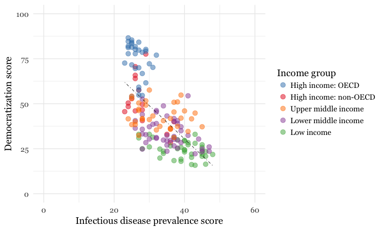
The following code creates a version of this chart with a qualitative ColorBrewer palette for the points, to color them by the World Bank income group.
# make static chart
disease_democ_chart <- ggplot(disease_democ, aes(x=infect_rate,
                                                 y=democ_score,
                                                 text=paste0(country,"<br>",
                                                             "Disease: ",infect_rate,"<br>",
                                                             "Democratization: ",democ_score),
                                                 group = 1)) +
  xlab("Infectious disease prevalence score") +
  ylab("Democratization score") +
  theme_minimal(base_size = 14) +
  geom_smooth(method = lm, se = FALSE, color = "black", linetype = "dotdash", size = 0.3) +
  geom_point(aes(color=income_group), size = 3, alpha = 0.5) +
  scale_x_continuous(limits=c(0,60)) +
  scale_y_continuous(limits=c(0,100)) +
  scale_color_brewer(palette = "Set1",
                     name="Income group",
                     breaks=c("High income: OECD","High income: non-OECD","Upper middle income","Lower middle income","Low income"))

# make interactive version
disease_democ_interactive <- ggplotly(disease_democ_chart, tooltip="text") %>%
  config(displayModeBar = FALSE)

# plot the chart
print(disease_democ_interactive)
Here’s the static version:

And here’s the interactive:
Notice that the scale_color_brewer code that ordered the items in the legend in the static ggplot chart was not inherited by the interactive plotly version.
But we can fix that by first running this code:
disease_democ <- disease_democ %>%
  mutate(income_group = factor(income_group, levels = c("High income: non-OECD",
                                               "High income: OECD",
                                               "Upper middle income",
                                               "Lower middle income",
                                               "Low income"))) %>%
  arrange(income_group)
This converts income_group into a categorical variable, or factor, and then sorts the data frame in order of its categories, or levels.
Running the chart code as before will now fix the order of the items in the legend in the interactive chart.
Make an interactive version of the California kindergarten immunization heatmap
Here’s another example of making an interactive chart with a tooltip:
# load data
immun <- read_csv("kindergarten.csv")

# calculate percentage incomplete, by county, by year
immun_counties_year <- immun %>%
  group_by(county, start_year) %>%
  summarize(enrolled = sum(enrollment, na.rm = TRUE),
            completed = sum(complete, na.rm = TRUE)) %>%
  mutate(pc_incomplete = round((enrolled-completed)/enrolled*100,2))

# static heat map, all counties, by year
immun_counties_year_chart <- ggplot(immun_counties_year, aes(x = start_year,
                                                             y = county,
                                                             text = paste0("<b>Year: </b>", start_year,"<br>",
                                                                           "<b>County: </b>", county,"<br>",
                                                                           "<b>% incomplete: </b>", pc_incomplete,"<br>"),
                                                             group = 1)) +
  geom_tile(aes(fill = pc_incomplete), color = "white") +
  scale_fill_gradient(low = "white",
                      high = "red",
                      name="% incomplete") +
  scale_x_continuous(breaks = c(2002,2004,2006,2008,2010,2012,2014)) +
  theme_minimal(base_size = 12, base_family = "Georgia") +
  xlab("") +
  ylab("") +
  theme(panel.grid.major = element_blank(),
        panel.grid.minor = element_blank(),
        legend.position="bottom",
        legend.key.height = unit(0.4, "cm")) +
  ggtitle("Immunization in California kindergartens, by county")

plot(immun_counties_year_chart)

# interactive version
immun_counties_year_chart_interactive <- ggplotly(immun_counties_year_chart, tooltip = "text") %>%
  config(displayModeBar = FALSE)

print(immun_counties_year_chart_interactive)
This should be the result:
Practice making other interactive charts
In class, as time allows, we’ll use plotly to create interactive versions of these ggplot2 charts:


Make a map of seismic risk and earthquakes using Leaflet
Leaflet is the most widely-used JavaScript library for making interactive online maps. It can be used from R with the leaflet package, another part of the htmlwidgets framework. So we need to install and load that, together with a package called rgdal, which makes it possible to load shapefiles and other geodata into R.
# install and load leaflet and rdgal
install.packages("leaflet")
install.packages("rgdal")
library(leaflet)
library(rgdal)
First let’s see how to make a basic Leaflet map, centered on Santa Cruz:
# make leaflet map centered on Santa Cruz
leaflet() %>%
  setView(lng = -122.0825853, lat = 36.9758862, zoom = 11) %>%
  addTiles()
This map should appear in the Viewer:
The leaflet function creates a leaflet map.
The setView function sets the starting position of the map, centering it on the defined coordinates and with the defined zoom level; addTiles adds OpenStreetMap tiles to the map, which would otherwise be blank. Notice that the map is interactive, and can be panned and zoomed just like a Google Map.
We aren’t limited to using OpenStreetMap tiles:
# make leaflet map centered on Santa Cruz with Carto tiles
leaflet() %>%
  setView(lng = -122.0825853, lat = 36.9758862, zoom = 11) %>%
  addProviderTiles("CartoDB.Positron")
The map should now look like this:
The addProviderTiles function uses the Leaflet Providers plugin to add various tiles to a map. You can see the available options here.
Now load the data we need to make the earthquakes map, starting with the seismic shapefile, using the readOGR function from rgdal.
# load seismic risk shapefile
seismic <- readOGR("seismic", "seismic")
The two mentions of seismic refer to the folder and the shapefile within it, respectively.
You should now have in your environment an object called seismic which is a SpatialPolygonsDataFrame.
We can also load data on earthquakes, directly from the US Geological Survey earthquakes API, described in the notes for the class on finding and downloading data:
# load quakes data from USGS earthquakes API
quakes <- read_csv("https://earthquake.usgs.gov/fdsnws/event/1/query?starttime=1960-01-01T00:00:00&minmagnitude=6&format=csv&latitude=39.828175&longitude=-98.5795&maxradiuskm=6000&orderby=magnitude")
Using this url, we have loaded earthquakes since the start of 1960 that had a magnitude of 6 and above, within a 6,000 kilometer radius of the geographic center of the continental United States.
Let’s look at a summary of the seismic data:
# view summary of seismic_risk data
summary(seismic)
This should be returned in the R Console:
Object of class SpatialPolygonsDataFrame
Coordinates:
      min       max
x -124.71 -66.98701
y   24.60  49.36968
Is projected: FALSE
proj4string :
[+proj=longlat +datum=WGS84 +no_defs +ellps=WGS84 +towgs84=0,0,0]
Data attributes:
   ValueRange
 < 1    : 3
 1 - 2  :12
 10 - 12: 2
 2 - 5  : 8
 5 - 10 : 4
The data defining the annual risk of a damaging earthquake is in the variable ValueRange. But the categories of this binned variable are not in the right order. To correct that, we should convert the variable from text to a factor, or categorical variable, with its levels in the right order.
# convert to factor/categorical variable
seismic@data <- seismic@data %>%
  mutate(ValueRange = factor(ValueRange, levels = c("< 1","1 - 2","2 - 5","5 - 10", "10 - 12")))

# view summary of seismic_risk data
summary(seismic)
Now the categories should be in the correct order:
Object of class SpatialPolygonsDataFrame
Coordinates:
      min       max
x -124.71 -66.98701
y   24.60  49.36968
Is projected: FALSE
proj4string :
[+proj=longlat +datum=WGS84 +no_defs +ellps=WGS84 +towgs84=0,0,0]
Data attributes:
   ValueRange
 < 1    : 3
 1 - 2  :12
 2 - 5  : 8
 5 - 10 : 4
 10 - 12: 2
Notice that to run dplyr code to mutate
Next we will load the seismic risk data into a leaflet map:
# load the seismic risk data into a leaflet map
seismic_map <- leaflet(data = seismic)
You should now see an object of type leaflet in your environment.
Now we can make a map with two layers just a few lines of code:
# set color palette
pal <- colorFactor("Reds", seismic$ValueRange)

# plot map
seismic_map %>%
  setView(lng = -98.5795, lat = 39.828175, zoom = 4) %>%
  addProviderTiles("CartoDB.Positron") %>%
  addPolygons(
    stroke = FALSE,
    fillOpacity = 0.7,
    smoothFactor = 0.1,
    color = ~pal(ValueRange)
  ) %>%
  # add historical earthquakes
  addCircles(
    data = quakes,
    radius = sqrt(10^quakes$mag)*30,
    color = "#000000",
    weight = 0.2,
    fillColor ="#ffffff",
    fillOpacity = 0.5,
    popup = paste0("<strong>Magnitude: </strong>", quakes$mag, "</br>",
                   "<strong>Date: </strong>", format(as.Date(quakes$time), "%b %d, %Y"))
  ) %>%
  # add legend
  addLegend(
    "bottomright", pal = pal, values = ~ValueRange,
    title = "annual % risk of damaging quake",
    opacity = 0.7,
    labels = labels
  )
This should be the result:
The function colorFactor assigns a named ColorBrewer palette to a categorical variable.
The function addPolygons adds polygons to the map: stroke = FALSE gives them no outline; fillOpacity = 0.7 makes them slightly transparent; color = ~pal(ValueRange)) uses the palette to color the polygons according to values in the ValueRange data.
(To see how to set up a color palette for a continuous variable, see this class.)
smoothFactor controls the extent to which the polygons are simplified. See what happens to the map if you replace 0.1 with 10. Simplified polygons will load more quickly, but there’s a trade-off with the appearance of the map. Choose an appropriate value for your maps through trial and error.
addCircles adds circles to the map, using the quakes data; color sets the color for their outlines, while weight sets the thickness of these lines; fillColor and fillOpacity style the circles’ interiors.
The size of the circles is set by radius = sqrt(quakes$mag^10)*30. Here 30 is simply a scaling factor for all of the circles, set by trial and error to give a reasonable appearance on the map. The size of the circles is set from the variable mag in the quakes data, which is their magnitude. We have raised 10 to the power of these magnitude values: As we discussed previously, this is a quirk of working with earthquake magnitudes, which are on a logarithmic scale, so that a magnitude difference of 1 corresponds to a 10-fold difference in earth movement, as recorded on a seismogram.
When scaling circles to make a Leaflet map, use the values from the data, but always take their square roots, using the sqrt function. This is important, to ensure that the circles are scaled correctly, by area, rather than by radius. The code sets the diameter (or twice the radius) of the circles, so the sqrt is necessary to correct for the squaring of these values in the equation for the area of a circle: Area = π * r^2.
popup is used to define the HTML code the appears in the popup that appears when any quake is clicked or tapped. The code above again uses paste0 to concatenate a series of elements, separated by commas, that will write the HTML. They include the mag and time values from the quakes data, the latter being formatted as an easy-to-read date using R’s format function for dates. See here for more on formatting dates in R.
I hope these examples illustrate the potential of htmlwidgets. There are many more which we have not covered. Understanding how the code for each will take some time. But if you follow the documentation, the results can be impressive.
Further reading/resources
htmlwidgets Showcase
Links to documentation and code examples for the leading htmlwidgets.
htmlwidgets Gallery
A more extensive collection of htmlwidgets
Plotly for R
Look here for more options to customize your charts, including layout options like formatting tooltips. Note, you can also make charts directly in R without going through ggplot2.