Iteration and animation: GIFs and videos
In today’s class, we will make animated GIFs and videos from charts made in R with ggplot2, using the gganimate package.
The data we will use today
Download the data for this session from here, unzip the folder and place it on your desktop. It contains the following folders and files:
nations.csvData from the World Bank Indicators portal, as used in week 3 and subsequently.warming.csvNational Oceanic and Atmospheric Administration data on the annual average global temperature, from 1880 to 2017.yearvalueAverage global temperature, compared to average from 1900-2000.
simulations.csvData from NASA simulations of historical temperatures, estimating the effect of natural and human influences on climate, processed from the raw data used for this piece from Bloomberg News. Contains the following variables:yeartypeNatural or HumanvalueGlobal average temperature from the simulation, relative to average simulated value from 1990-2000.
Setting up
Launch RStudio Cloud, upload the zipped folder with the data, and save a new R script as animations.R.
Install gganimate and other packages on which it depends
From the Packages panel, install the following packages: gganimate, transformr, gifski, png.
You can install them in one go, separated by spaces or commas. Make sure to have Install dependencies chacked.
Load the packages we will use today
# load required packages
library(readr)
library(ggplot2)
library(gganimate)
library(scales)
library(dplyr)
Apart from gganimate, we have encountered all of these packages in previous weeks.
Make a Gapminder-style animated bubble chart
The notes from the static charts class show how to make the following chart, showing GDP per capita, life expectancy at birth and population for the world’s nations in 2016:
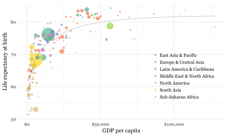
This was the code to generate that chart:
# load data
nations <- read_csv("animations-r/nations.csv")

# make sure that year is treated as an integer
nations <- nations %>%
    mutate(year = as.integer(year))

# filter for 2016 data only
nations2016 <- nations %>%
  filter(year == 2016)

# make bubble chart
ggplot(nations2016, aes(x = gdp_percap, y = life_expect)) +
  xlab("GDP per capita") +
  ylab("Life expectancy at birth") +
  theme_minimal(base_size = 14, base_family = "Georgia") +
  geom_point(aes(size = population, color = region), alpha = 0.7) +
  scale_size_area(guide = FALSE, max_size = 15) +
  scale_x_continuous(labels = dollar) +
  stat_smooth(formula = y ~ log10(x), se = FALSE, size = 0.5, color = "black", linetype="dotted") +
  scale_color_brewer(name = "", palette = "Set2") +
  theme(legend.position=c(0.8,0.4))
Some reminders about what this code does:
scale_size_areaensures that the size of the circles scales by their area according to the population data, up to the specifiedmax_size;guide = FALSEwithin the brackets of this function prevents a legend for size being drawn.labels = dollarfrom scales formats the X axis labels as currency in dollars.stat_smoothworks likegeom_smoothbut allows you to use aformulato specify the type of curve to use for to trend line fitted to the data, here a logarithmic curve.
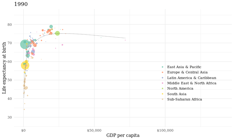
Now we will use gganimate to generate an animation of the chart, from 1990 to 2016. Here is the code:
# animate entire time series with gganimate
nations_plot <- ggplot(nations, aes(x = gdp_percap, y = life_expect)) +
  xlab("GDP per capita") +
  ylab("Life expectancy at birth") +
  theme_minimal(base_size = 14, base_family = "Georgia") +
  geom_point(aes(size = population, color = region), alpha = 0.7) +
  scale_size_area(guide = FALSE, max_size = 15) +
  scale_x_continuous(labels = dollar) +
  stat_smooth(formula = y ~ log10(x), se = FALSE, size = 0.5, color = "black", linetype="dotted") +
  scale_color_brewer(name = "", palette = "Set2") +
  theme(legend.position=c(0.8,0.4)) +
  # gganimate code
  ggtitle("{frame_time}") +
  transition_time(year) +
  ease_aes("linear") +
  enter_fade() +
  exit_fade()
Running this code will create an R object of type gganim called nations_plot.
Now display it in the Viewer panel by running the following:
animate(nations_plot)
How the gganimate code works
transition_timeThis function animates the data byyear, showing only the data that is relevant for any one point in time. As well as generating a frame for each year, it also generates intermediate frames to give a smooth animation.- Using
"{frame_time}"within theggtitlefunction puts a title on each frame with the corresponding value from the variable in thetransition_timefunction, hereyear. (The earlier conversion ofyearto integer ensures that we don’t see decimal fractions in this title.) ease_aesThis controls how the animation progresses. If animating over a time series, always use the option"linear"to ensure a constant speed for the animation. Other available options can be used when animating between different states of a chart, rather than over time, as we will see below.enter_fadeexit_fadeThese functions control the behavior where a data point appears or disappears from the animation. You can also useenter_shrinkandexit_shrink.
Save as a GIF and a video
We can now save the animation as a GIF or video.
# save as a GIF
animate(nations_plot, fps = 10, end_pause = 30, width = 750, height = 450)
anim_save("nations.gif")

# save as a video
animate(nations_plot, renderer = ffmpeg_renderer(), fps = 30, duration = 20, width = 800, height = 450)
anim_save("nations.mp4")
You can use the options width and height to set the dimensions, in pixels, of the animation; fps sets the frame rate, in frames per second; for a GIF, you can add a pause at the end using end_pause, here set to 30 frames or 3 seconds at 10 frames a second.
To make a video, you need the code renderer = ffmpeg_renderer(); duration sets the duration of the video. The video code above also sets the ratio between width and height at 16:9, consistent with YouTube format.
FFmpeg, a sofware library for working with video and audio, is already installed in RStudio Cloud. If working on your own computer, you will need to follow the instructions on the software page to install FFmpeg.
Here is the GIF:
And here is the video:
Make a cumulative animation of historical global average temperature
For the Gapminder-style video, we displayed only the data for the year in question in each frame. In some cases, however, you may want to animate by adding data with each frame, and leaving the previously added data in place.
We will explore that now by making animations similar the dot-and-line chart in this video.
Here is the code to make a static version of the chart:
# load data
warming <- read_csv("animations-r/warming.csv")

# draw chart
warming_plot <- ggplot(warming, aes(x = year, y = value)) +
  geom_line(colour="black") +
  geom_point(shape = 21, colour = "black", aes(fill = value), size=5, stroke=1) +
  scale_x_continuous(limits = c(1880,2017)) +
  scale_y_continuous(limits = c(-0.5,1)) +
  scale_fill_distiller(palette = "RdYlBu", limits = c(-1,1), guide = FALSE) +
  xlab("") +
  ylab("Difference from 1900-2000 (ºC)") +
  theme_minimal(base_size = 16, base_family = "Georgia")
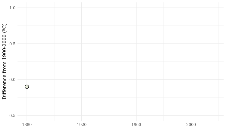
This should be the result:
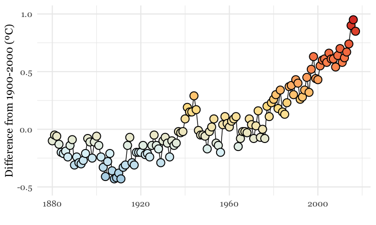
The file warming.csv contains the fields year and value, the latter being the global annual average temperature, compared to the 1900-2000 average.
As this is a dot-and-line chart, it includes both geom_line and geom_point layers. Notice that the geom_point function also defines a numbered shape: 21 is a circle with a filled area, see here for other options. By using this shape, we can set the outline color to black and then use an aes mapping to fill it with color, according to the temperature value.
The code uses scale_fill_distiller to use a ColorBrewer palette running from cool blues, through neutral yellows, to warm reds, applying them across a range of values from -1 to +1.
Again we can animate this data using gganimate:
# draw chart
warming_plot <- ggplot(warming, aes(x = year, y = value)) +
  geom_line(colour = "black") +
  geom_point(shape = 21, colour = "black", aes(fill = value), size = 5, stroke = 1) +
  scale_x_continuous(limits = c(1880,2017)) +
  scale_y_continuous(limits = c(-0.5,1)) +
  scale_fill_distiller(palette = "RdYlBu", limits = c(-1,1), guide = FALSE) +
  xlab("") +
  ylab("Difference from 1900-2000 (ºC)") +
  theme_minimal(base_size = 16, base_family = "Georgia") +
  # gganimate code
  transition_reveal(id = 1, along = year)

# save as a GIF
animate(warming_plot, fps = 10, end_pause = 30, width = 750, height = 450)
anim_save("warming.gif")
How the gganimate code works
transition_reveal. This keeps the previously revealed data in place as each value for thealongtime variable is added to the chart.
The default behavior for transition_reveal however, reveals the lines, but only plots the point for the current frame:
To create a cumulative animation of points, use code like this:
# draw chart
warming_points <- ggplot(warming, aes(x = year, y = value)) +
  geom_point(shape = 21, colour = "black", aes(fill = value), size=5, stroke=1) +
  scale_x_continuous(limits = c(1880,2017)) +
  scale_y_continuous(limits = c(-0.5,1)) +
  scale_fill_distiller(palette = "RdYlBu", limits = c(-1,1), guide = FALSE) +
  xlab("") +
  ylab("Difference from 1900-2000 (ºC)") +
  theme_minimal(base_size = 16, base_family = "Georgia") +
  # gganimate code
  transition_time(year) +
  shadow_mark()

# save as a GIF
animate(warming_points, fps = 10, end_pause = 30, width = 750, height = 450)
anim_save("warming_points.gif")
shadow_mark retains the data from previous frames.

Make an animation that switches between a simulation of human effects on global average emperature, and natural ones
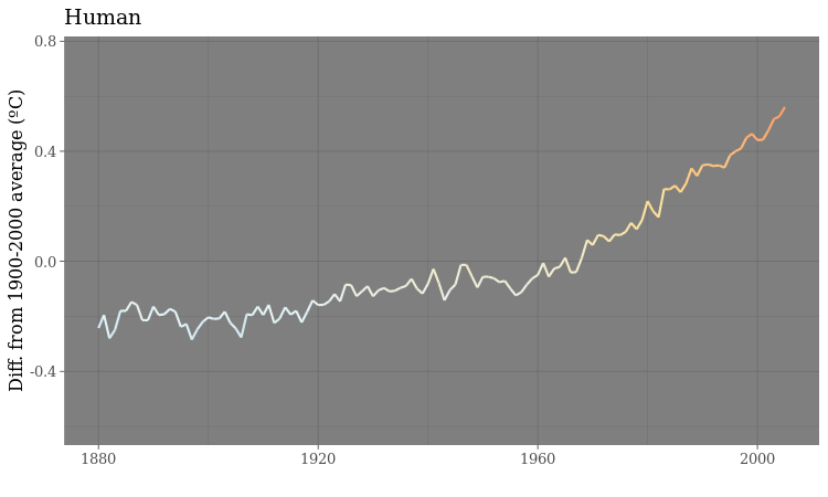
Looped animations can also be used to switch between different states, or filtered views of the data. To illustrate this we will load the NASA data showing a simulation from climate models of how the global average temperature would have changed under the influence of natural events, such as variation in radiation from the Sun and the cooling effect of soot from volcanoes, compared to human influences, mostly emissions of carbon dioxide and other greenhouse gases.
This code will load the data and make the animation:
# load data
simulations <- read_csv("animations-r/simulations.csv")

# draw chart
simulations_plot <- ggplot(simulations, aes(x=year, y=value, color = value)) +
  geom_line(size = 1) +
  scale_y_continuous(limits = c(-0.6,0.75)) +
  scale_colour_distiller(palette = "RdYlBu", limits = c(-1,1), guide = FALSE) +
  ylab("Diff. from 1900-2000 average (ºC)") +
  xlab("") +
  theme_dark(base_size = 16, base_family = "Georgia") +
  #gganimate code
  ggtitle("{closest_state}") +
  transition_states(
    type,
    transition_length = 0.5,
    state_length = 2
  ) +
  ease_aes("sine-in-out")

# save as a GIF
animate(simulations_plot, fps = 10, width = 750, height = 450)
anim_save("simulations.gif")
How the gganimate code works
transition_state. This switches between different filtered states of the data, here defined by the variabletype.transition_lengthis the length of the transition in seconds, andstate_lengthis the pause at each state, again in seconds.ease_aesWith a state transition animation, using options that vary the speed of the transition, with a slower start and finish than the middle section, give a more visually pleaseing effect. Try"cubic-in-out"or"sine_in_out"- Using
"{closest_state}"in theggtitlefunction displays the appropriate value for the variable used to define the states, heretype.
The GIF should look like this: