Making static maps and processing geodata with QGIS
Introducing QGIS
GQIS is the leading free, open source Geographic Information Systems (GIS) application. It is capable of sophisticated geodata processing and analysis, and also can be used to design publication-quality data-driven maps.
The possibilities are almost endless, but you don’t need to be a GIS expert to put it to effective use for both displaying geographic data in static maps, and for processing data for use in making interactive online maps.
Launch QGIS, and you should see a screen like this:
The data we will use
Download the data from this session from here, unzip the folder and place it on your desktop. It contains several subfolders, with the following files:
Earthquakes
quakes_1964_2013_5+.csvEarthquakes with a magnitude of 5 and greater that occurred within a circles of radius 6,000 kilometres, extending from geographical center of the continental United States. From U.S. Geological Survey data.seismic_riskShapefile detailing the risk of experiencing a damaging earthquake by location for a geographical region focused on the continental the United States, from the U.S. Geological Survey.seismic_risk_clipThe same data, clipped to the boundaries of the continental United States.
General
ne_50m_admin_0_countriesne_50m_lakesGlobal shapefiles from Natural Earth giving boundaries for nations and lakes respectively.
GDP
gdp_pc_2013.csvgdp_pc_2013,csvtCSV file with World Bank data on Gross Domestic Product per capita for the world’s nations in 2013, in current international dollars, corrected for purchasing power in different territories. The second file is necessary to perform a data “join” in QGIS.
SF
sf_test_addressesShapefile with geolocations for the same addresses we geocoded in this morning’s session.
Storms
storms.csvShapefile with data on tropical storms and hurricanes in the North Atlantic compiled by the U.S. National Oceanic and Atmospheric Administration (NOAA). I have processed the raw data to give the following fields for storms from 1990 onwards:nameOfficial name for each storm; unnamed storms are listed as Unnamed and also numbered.yearmonthdayhourminuteDate and time fields for each observation.timestampDate and time fields combined into a full timestamp for each observation inYYYY-MM-DD HH:MMformat.record_identThe entryLindicates the time at which a storm made landfall, defined as the center of the system crossing a coastline, recorded from 1991 onwards.statusOptions includeHUfor hurricane,TSfor tropical storm andTDfor tropical depression.latitudelongitudeGeographic coordinates for the center of the system at each observation.max_wind_ktsmax_wind_kphmax_wind_mphMaximum sustained wind for each observation in various units.min_pressMinimum air pressure at the center of the system for each observation in millibars.
newhurdat-format.pdfMore explanation of the raw storms data from NOAA, including the full list of stormstatuscodes.
Syria
2013_Q1Shapefile with data on violent events in the Syrian civil war from the first quarter of 2013, derived from GDELT project data. See here for more on how these events were classified.
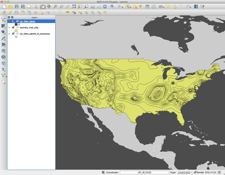
Map seismic risk and historical earthquakes in the continental United States
Make a choropleth map showing seismic risk
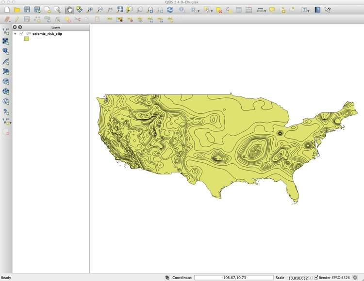
We will first import a shapefile based on data from the U.S. Geological Survey, detailing the risk of experiencing a damaging earthquake for the lower 48 states. The file is in the subfolder seismic_risk_clip.
Select Layer>Add vector layer or click on this icon:

At the dialog box, click Browse and navigate to the file seismic_risk_clip.shp. It is important that you select the file with the .shp extension. Then click open, and the following map of the continental United States should appear, filled with a random color:
You can turn off the visibility of any layer by unchecking its box in the Layers panel. This can be useful to see the status of layers that would otherwise be obscured.
These controls allow you to pan and zoom the display:
You can focus the display on the full extent of any layer by right-clicking it in the Layers panel and selecting Zoom to layer.
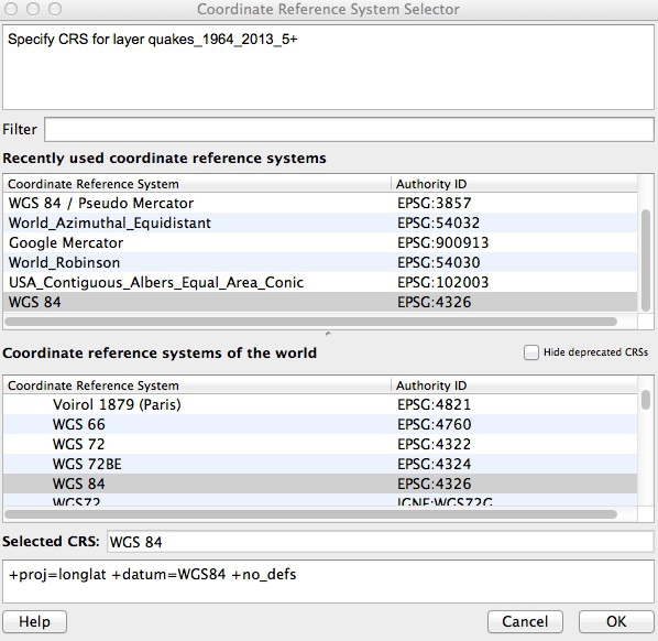
Notice EPSG:4326 at the bottom right. This defines the projection for the layer. Right-click on seismic_risk_clip in the Layers panel at left and select Properties>General. You should see the following under Coordinate reference system:
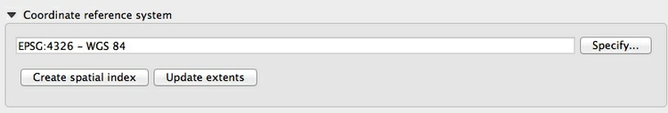
EPSG:4326 and WGS 84 are two names for the unprojected Equirectangular view we saw in the opening session. Strictly speaking, it refers to a datum, not a projection. We will select a projection for our work later. Click Cancel or OK to close Properties for this layer.
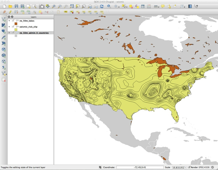
Now let’s import a basemap for this project. We will use two Natural Earth shapefiles to do this, in the subfolders ne_50m_admin_0_countries and ne_50m_lakes. Import the shapefiles as before, then drag and drop them within the Layers panel so that they appear in the following order:
Having imported all the layers, save your project by selecting Project>Save from the top menu. Keep saving your projects at regular intervals.
Now we will style the basemap. Right-click on ne_50m_admin_0_countries in the Layers panel and select Properties>Style. We are going to give the land a single color, so the default Single Symbol option from the top dropdown menu is correct. Click on Simple fill to call up the following options:
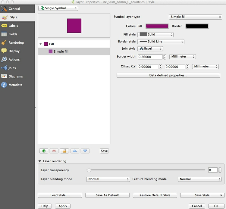
Click on Colors Fill to call up the Select fill color picker. There are a range of options. In the default tab, enter the HEX value #cccccc into the HTML notation box to select a neutral gray color:
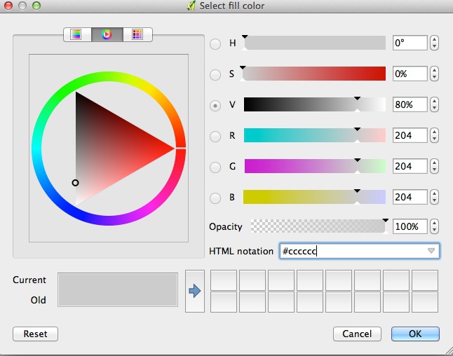
Click OK, then repeat the process for Border, giving it the color #ffffff for white. Click OK to close the Properties windows, accepting the changes:
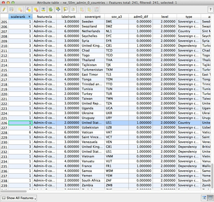
We imported ne_50_m_lakes to include the Great Lakes on the map, not to show smaller lakes, so in styling the lakes layer we need to filter out the smaller lakes. This means styling according to data values, so we need to look at the table of data attached to this shapefile.
Select ne_50_m_lakes in the Layers panel, right-click and select Open Attribute Table, or click on this icon in the toolbar at top:

This table should open:
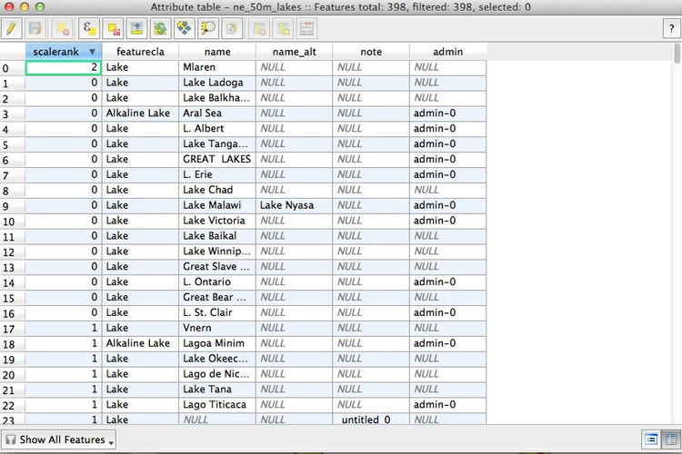
Notice that the table contains a field called scalerank, in which the largest lakes — including the Great Lakes — have the value 0.
Right-click on ne_50_m_lakes in the Layers panel and select Properties>Style. Select Categorized from the dropdown menu at top, and under Column select scalerank. Click the Classify button, then select everything apart from the symbol with the value 0:
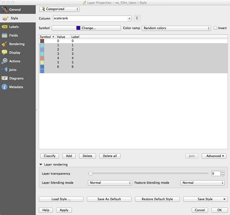
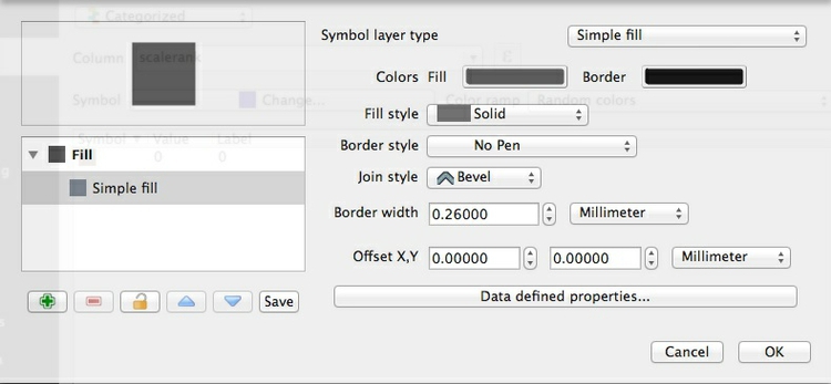
Click the Delete button to remove the other symbols and then double-click on the remaining symbol. At the next dialog box select Simple fill and change the Fill color to #4c4c4c and the Border style to No Pen:
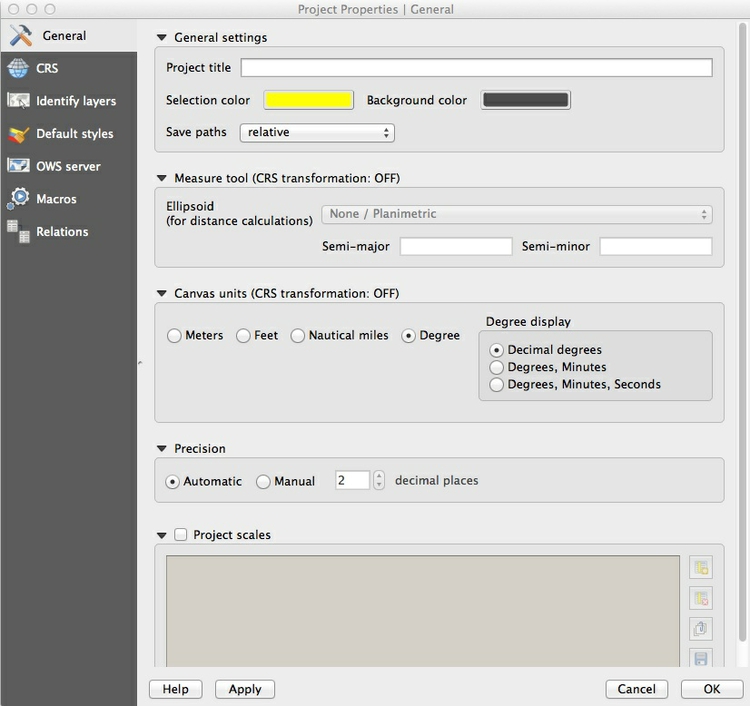
To make the background ocean color to match the large lakes, select Project>Project Properties>General from the top menu, and change the Background color to #4c4c4c:
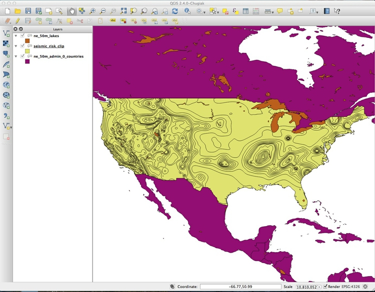
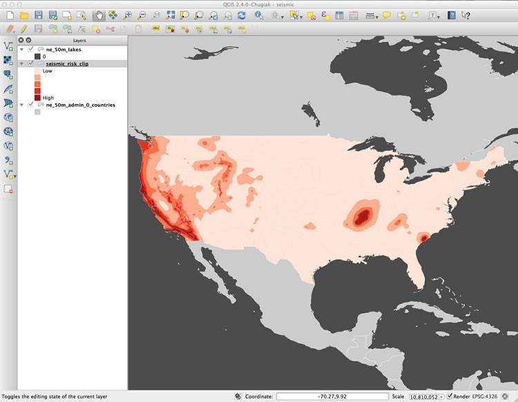
The map should now look like this:
Now we need to color the areas for the seismic_risk_clip layer. Open its attribute table, and notice that it contains a field called ACC_VAL. These numbers refer to the ground acceleration predicted for a large quake with a 2% chance of occurring in 50 years, expressed as a percentage of g, the acceleration of a body falling under gravity. The numbers go as high as 200, meaning a quake with ground acceleration of twice g. The details of the units are unimportant to most people, so we will just divide the data into five categories, from low to high risk of experiencing a damaging earthquake.
To do this, close the attribute table and call up Properties>Style for the seismic_risk_clip layer. Select Graduated from the dropdown menu at top, which is the option to color data according to values of a continuous variable. Select 5 under Classes, and then New color ramp... under Color ramp. While QGIS has many available color ramps, we will use this opportunity to call in a ColorBrewer sequential color scheme. At the dialog box select ColorBrewer and then Reds, and then click OK:
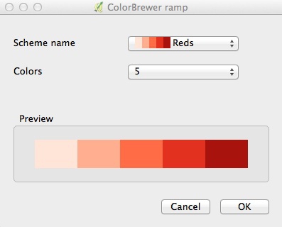
You will need to give the color ramp a name — the default Reds5 is fine. Select ACC_VAL under Column and then click the Classify button to produce the following display:
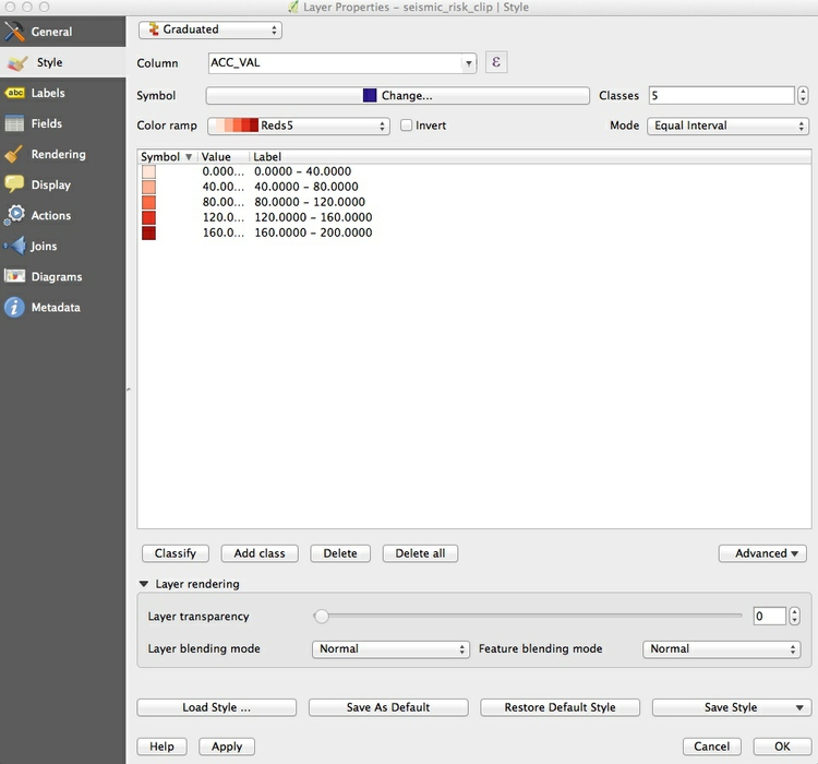
Note that the Mode dropdown menu gives various options for automatically setting the boundaries between the five classes or bins, which includes Equal Interval and Quantile (Equal Count) options.
However, in this case the choice does not matter because we are going to set the bins manually, using values I selected after viewing the USGS’s own map, to highlight the areas with the highest seismic risk.
Double-click on the first symbol and select 19 for the Upper value and click OK. Then double-click on the Label for this symbol and edit the text to Low. Carry on editing the values and labels until the display looks like this:
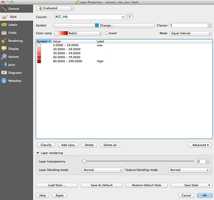
(Note that the ACC_VAL field contains only integer values, so we are not excluding any numbers between 19 and 20, and so on. Do take care when setting the values for data bins not to exclude any important data!)
Click on Change..., then select Simple fill and change the Border style to No Pen and click OK. This will remove the black borders between the areas of color.
If you are likely to want to style data in the same format in the same way in future, it is a good idea to click the Save Style button at bottom right and save as a QGIS Layer Style File, which is a variant of XML. When loaded using the Load Style ... button at bottom left, it will automatically apply the saved styling to future maps of similar data that you want to style in the same way.
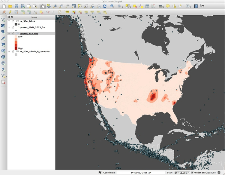
Now click OK to close the Properties>Style window to accept the changes to the style for the seismic_risk_clip layer. The map should look like this:
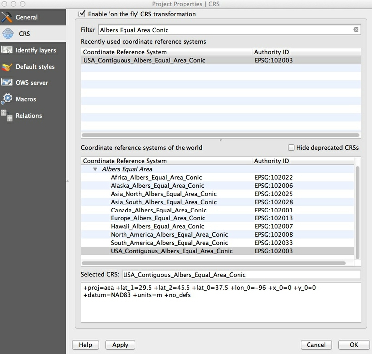
Now is a good time to give the project a projection. As our map is showing areas of high seismic risk for the United States, an Albers Equal Area Conic projection is a good choice.
Select Project>Project Properties>CRS (for Coordinate Reference System) from the top menu, and check Enable 'on the fly' CRS transformation. This will convert any subsequent layers we import into the Albers projection, also.
Type Albersinto the Filter box and select USA_Contiguous_Albers_Equal_Area_Conic, which has the code EPSG:102003:
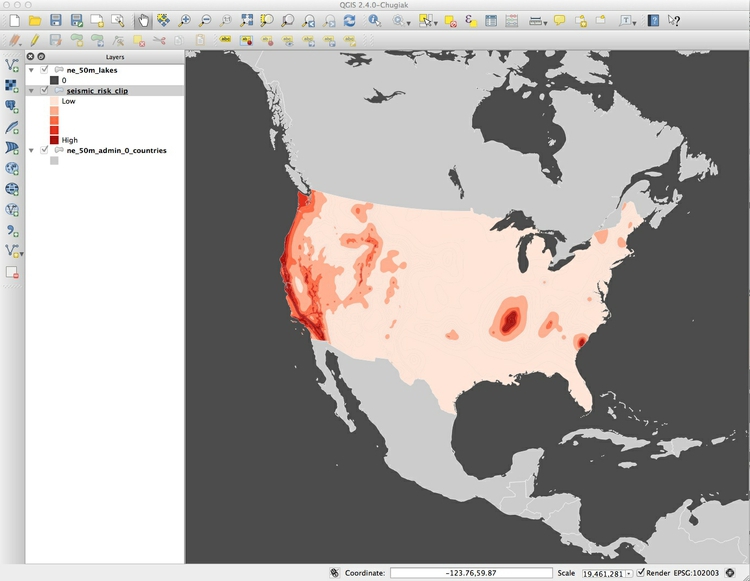
Click OK and the map should reproject. Notice how EPSG:102003 now appears at bottom right:
Add a layer showing moderate and large earthquakes over the past 50 years
The data for this layer is in the file quakes_1964_2013_5+.csv, which you created using the USGS earthquakes API in this morning’s session. As you will remember, it includes all earthquakes with a magnitude of 5 and greater from 1964 to 2013 inclusive, in a circle with a radius of 6,000 kilometers from the center of the continental United States.
To import a CSV or other delimited text file with points described by latitude and longitude coordinates, select Layer>Add Delimited Text Layer from the top menu or click this icon:

Browse to the file with the earthquake data, and ensure that the dialog box is filled in like this:
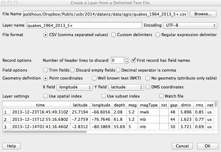
(If your file is not a CSV you will have to select the correct delimiter, and if your latitude and longitude fields have other names, you may have to select the X field (longitude) and Y field (latitude) manually.)
When you click OK you will be asked to select a projection, or CRS, for the data. You may be tempted to select the same Albers projection we have set for the project, but this will cause an error. QGIS will handle the conversion to that projection: Because this data is not yet projected, we should instead select WGS 84 EPSG:4326:
Click OK and a large number of points will be added to the map:
Now we will style these points, giving them a single color but sizing them according to the amount of shaking that quake each caused. Open the attribute table for the quakes layer and notice that it contains a field called mag, for earthquake magnitude. This is a logarithmic scale, so that a magnitude difference of 1 corresponds to a 10-fold difference in earth movement, as recorded on a seismogram, as this calculator shows:
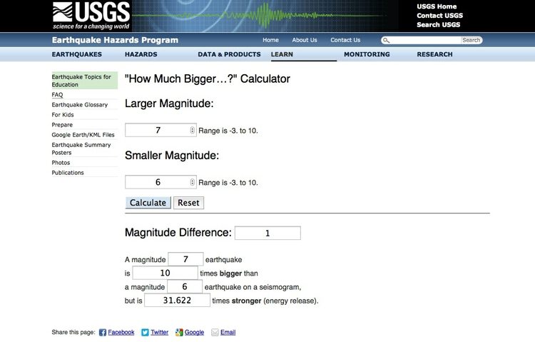
This means that the equation to convert magnitude into the amplitude of the shaking, as recorded on a seismogram, is: Amplitude = 10^Magnitude.
Select Properties>Style for the quakes layer, and accept Single Symbol from the top dropdown menu, as we are not going to color the points according to values in the data.
Select Simple marker, change the Fill to Snow and the Border to Iron.
Then select Marker and adjust the transparency to 50%:
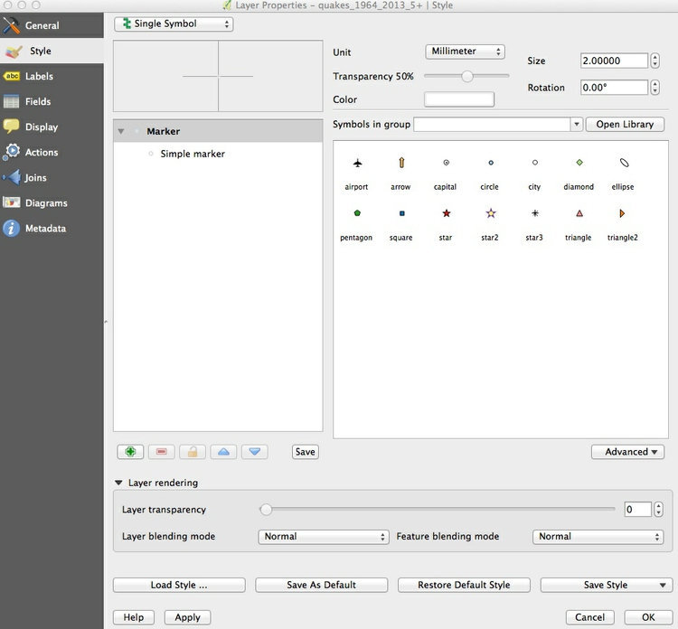
Now click the Advanced button to the right and select Size scaled field, making sure Scale area is checked (this will ensure that the circles we are about to draw scale correctly, by area). Then select - expression - and fill in the dialog box as follows:
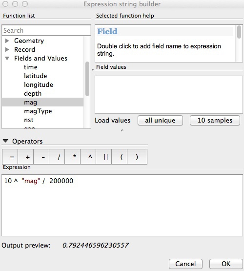
This incorporates the formula above, and then divides by 200,000 — which I found through trial and error gives a reasonable display.
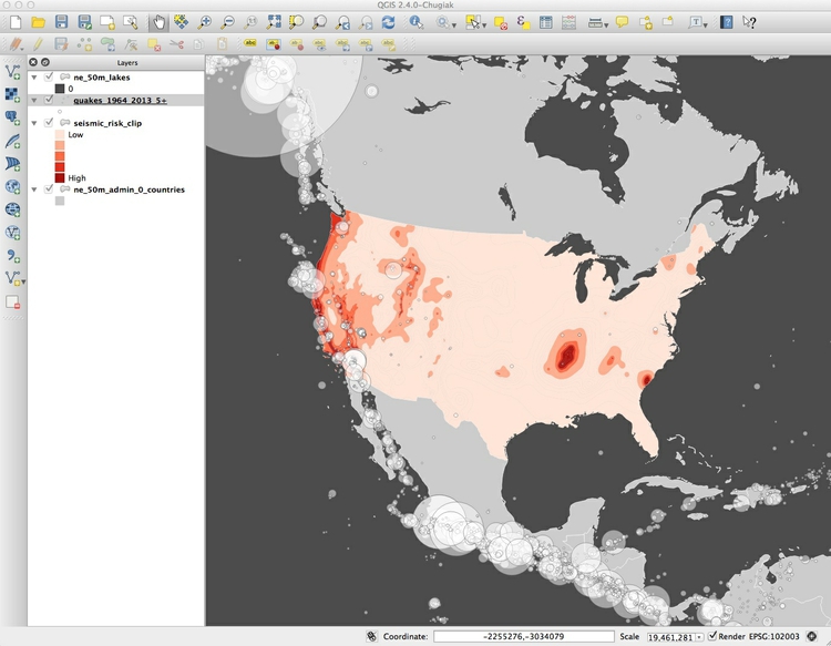
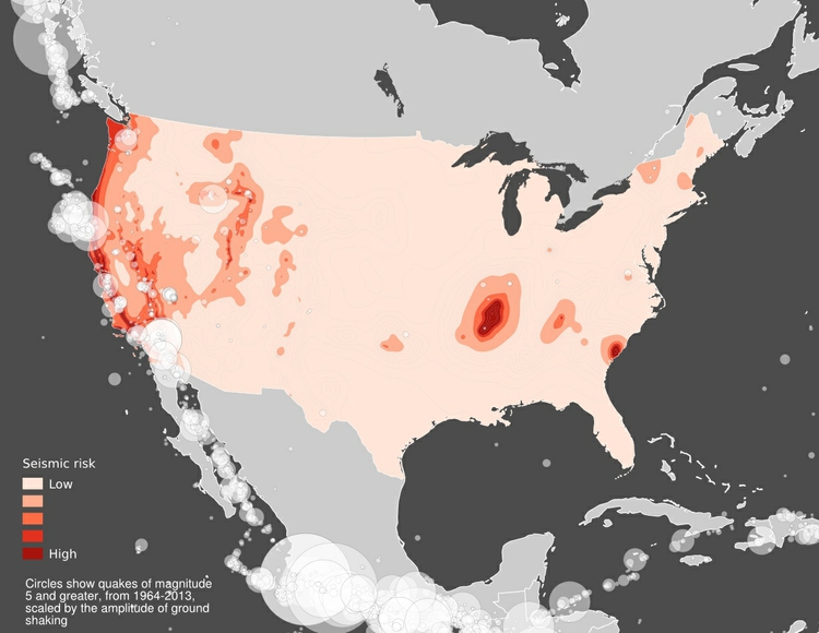
The final map should look like this:
Export finished map in vector graphic or raster image formats
We will export our finished map with a legend explaining the colors, so let’s change the name of that field so it displays nicely. Right-click on seismic_risk_clip in the Layers panel, select Rename and call it Seismic risk.
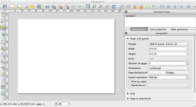
To export the map, select Project>New Print Composer, give the composer an appropriate name and click OK. In the print composer window, select the following options in the Composition tab:
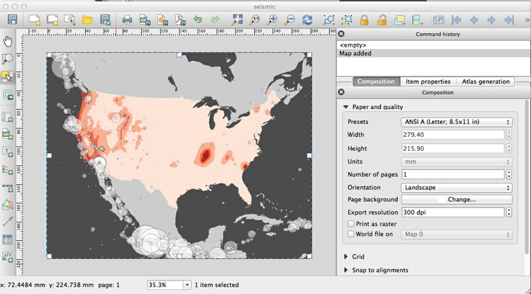
Now click the Add new map icon:

Draw a rectangle over the page area, and the map should appear:
If you are not happy with the display, delete the added map and adjust the main display as appropriate using the pan and zoom controls. Once you are statisfied with the appearance of your map in the print composer, click the Add legend icon:

Draw a rectangle over the map where you want the legend to appear. Don’t worry about resizing it for now, because we are going to edit the entries that appear:
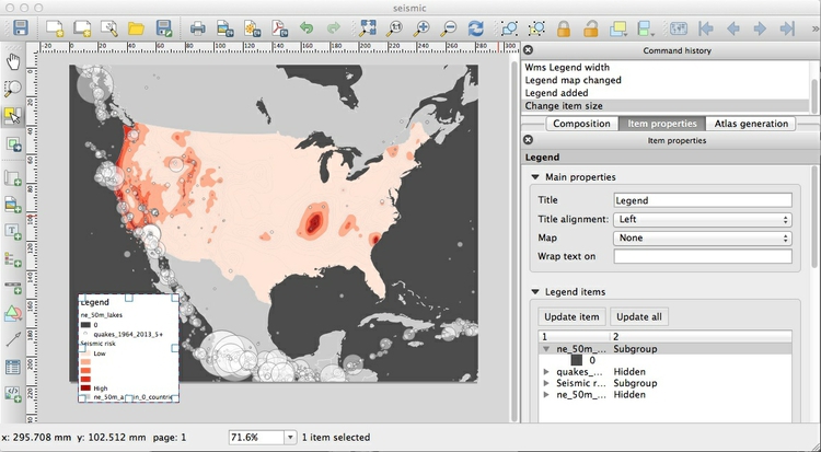
In the Item properties tab, first delete the Title amd then open Legend items by clicking on the small triangle next to it:
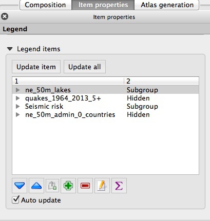
Select and delete, using the red minus symbol, each of the items apart from Seismic risk. Then close Legend items by clicking on the small triangle.
Open Fonts and change Font color... to Snow. Notice that the font type and sizes can be customized by clicking on the other buttons.
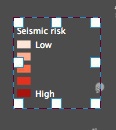
Uncheck Background and resize the legend as necessary, by dragging the white squares:
Finally we will add some text to explain the circles. Click on the Add new label icon, and draw a rectangle where you want the text to appear:

Under the Item properties tab, type the text in the Main properties box and again remove the background and adjust the font size as required.
Finally, the map can be exported in SVG and PDF vector formats by clicking these export icons:

Note that the SVG export may not clip the map to the page exactly. However, this can be fixed in a vector graphics editor such as Adobe Illustrator or Inkscape, and then saved as a PDF. This may provide a better rendering of the map than through a direct PDF export.
The final map should look like this:
You can save your maps in raster image formats (JPG, PNG etc) from the Print Composer by clicking the Save Image icon:

You can also save as an image from the main map display (so without any legend and annotation added in the Print Composer) by selecting Project>Save as Image from the top menu.
Save the QGIS project, and then select Project>New to open a new project.
Processing geodata with QGIS
In addition to displaying geographic data, QGIS is a powerful tool for processing data for use in the software itself, or by other mapping applications. If you want to make online maps, for instance, as we will do in day 2 of this workshop, QGIS can help get your data into the right shape. The rest of this session introduces some of QGIS’s data-processing functionality, but there is much more to explore — see the further reading to dig deeper.
Join external data to a shapefile
In your new project, import the ne_50m_admin_0_countries shapefile. Right-click on it in the Layers panel and Save As ... an ESRI shapefile, , keeping the default WGS 84 CRS. Browse to your working folder, call the new file gpd_pc and check the option to Add saved file to map.
Open its attribute table of the new shapefile and notice that it contains a field called iso_a3, which is a three-letter code for each country, assigned by the International Organization for Standardization.
Now use Add Vector Layer to import the file gdp_pc_2013.csv. (Note that when joining external data in a CSV file to a shapefile, you do not import the file as a delimited text file, as we did previously to display data on a map.)
After import, this file will appear as an isolated table in the Layers panel. Select it and open the attribute table to view the data, which contains country names, the three-letter country codes, and data on GDP per capita in 2013:
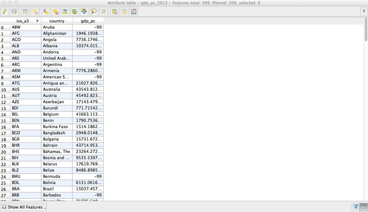
Notice that some cells contain the value -99, which is here being used to designate null values, where there is no data.
The same subfolder with the file also contains the file gdp_pc_2013.csvt. This contains information about the type of data in each field of the CSV file, in this case:
"String","String","Real"
When we make the join, this will tell QGIS what sort of data is in each field of the CSV file. String indicates a string of text, Real indicates numbers that can include decimals, while Integer indicates whole numbers. Without this information, QGIS will treat all of the fields in the file as text.
Close the attribute table once more, right-click on the gdp_pc shapefile and select Properties>Joins. Click the green plus sign and fill in the dialog box as follows to join the CSV file to the shapefile by the iso_a3 three-letter country codes:
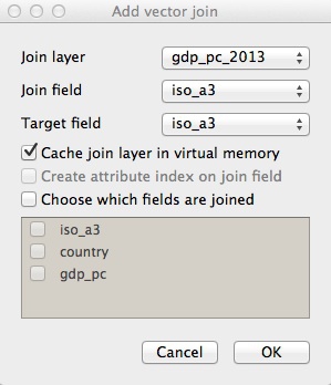
After completing the join, open the shapefile’s attribute table once more to confirm that the data from the CSV file has appeared.
Save the joined data in another geodata format
Right-click on the joined shapefile, select Save As ... and notice the Format options include ESRI shapefile, GeoJSON and KML. You are also able to choose a projection (CRS) for the new shapefile and restrict its extent by latitude and longitude coordinates.
Save this file as GeoJSON with an appropriate name, keeping the default WGS 84 CRS.
Simplify the joined data, and save again
When displaying geodata online, it is sometimes necessary to simplify boundary data to give a smaller file size, allowing faster loading in a web browser.
Select the joined shapefile, then select Vector>Geometry Tools>Simplify geometries, and fill in the dialog box as follows, saving as a shapefile with a new name:
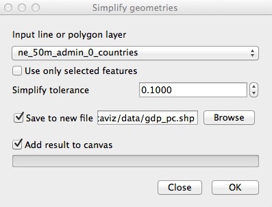
In practice, you will want to experiment with different values for Simplify tolerance to give an acceptable trade-off between file size and appearance at high zoom levels.
Save the simplified file as GeoJSON, and compare the file size with the previously saved version.
Alternatively, you can also simplify geodata outside of QGIS using the mapshaper web app. This has the advantage that you can move a slider to control the amount of simplification, and see the effect that this will have before exporting the simplified file.
Use QGIS’s vector geoprocessing tools
Start a new project, and import both the ne_50m_admin_0_countries shapefile, and the seismic_risk shapefile. This is original version of the file we used to make the seismic risk map, extending beyond the boundaries and coastline of the United States:
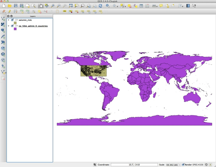
Open the attribute table for the countries shapefile, and select the United States:
Close the attribute table once more, and turn off the visibility of the seismic risk layer briefly to confirm that the United States is now highlighted.
Select Vector>Geoprocessing Tools>Clip and fill in the dialog box as follows, making sure that Use only selected features is checked for the Clip layer:
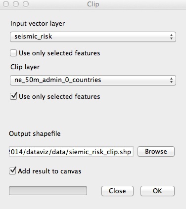
Click OK and a new shapefile will be created, clipped to the borders and coastline of the United States. This is how I made the shapefile we used to make the first map.
Sometimes you may need to draw your own shape to clip to, rather than using existing geodata. When drawing shapes based on city streets, this web app can be a useful tool. Select the Polygon and KML options from the dropdown menu and draw your shape over the basemap.
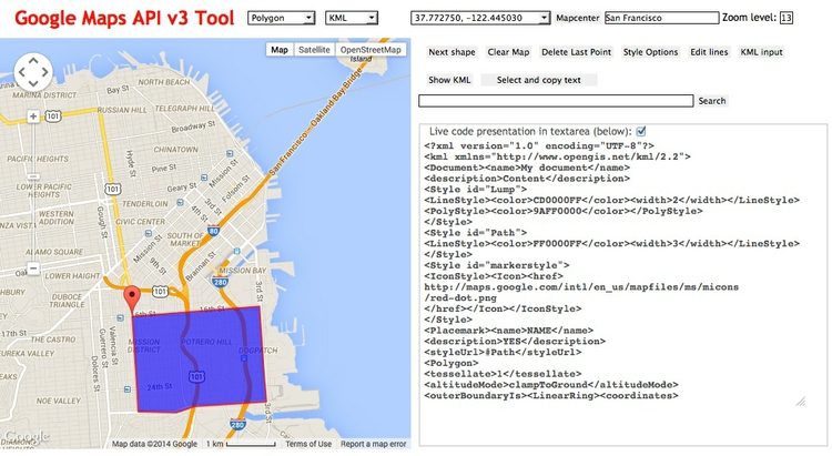
Paste the resulting code into a text file and save with the extension .kml. You can then use this KML file as a clip layer in QGIS.
Look at the other options in the Vector>Geoprocessing Tools menu. Their icons give a good idea of what they do; see here for a full explanation. (Intersect is similar to Clip, except that it includes data from both layers in the new attribute table.)
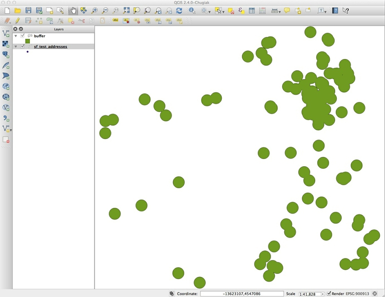
Now open a new project, and import the shapefile sf_test_addresses. I made this shapefile from the addresses we geocoded in this morning’s session. I saved it in a Google Mercator projection, also known as EPSG:900913, used for Google and other online maps.
This is important, because we are going to create a “buffer” defining areas within 1,000 feet of the nearest point. For this we need a projection with units defined in distance, rather than degrees, which is the unit for the WGS 84 datum.
Creating a buffer shapefile is a task you might perform if, for example, working out which areas are off-limits for sex offenders under residency restrictions.
Select Vector>Geoprocessing Tools>Buffer(s)... and fill in the dialog box as follows:
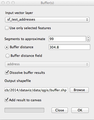
Selecting the maximum value of 99 under Segments to approximate ensures that the resulting shapes are as smooth as possible. Buffer distance is set to 304.8 because the projection’s units are meters; this value gives the 1,000 feet we require. Checking Dissolve buffer results merges overlapping buffers into the same polygon.
Click OK, and this should be the result:
Install QGIS plugins
QGIS has an active community of open-source developers who have developed
many plugins that perform specific tasks. We are going to install three useful plugins to complete our geodata processing tutorial.
From the top menu select Plugins>Manage and Install Plugins... and search for MMQGIS. Select the plugin, and click the Install plugin button. Repeat the process for Points2One.
You should now have an MMQGIS menu at top, and the following icon should have appeared in the left toolbar:

Convert points to lines for North Atlantic storm data
Open a new project, and import the storms shapefile. It consists of points, each corresponding to a single observation of each storm, which we need to turn into tracks for each storm, using the Points2One plugin.
To do this, we need a field to uniquely identify each storm, so let’s open the attribute table and look at the data. Because storm names may reused in different years, this doesn’t exist. However, if we combine year and name, that will be a unique identifier for each storm. (In fact, it will also split one storm, “Zeta,” which started in December 2005 and continued into January 2006, into two, but we will not worry about that.)
To do this, select the Toggle Editing icon at top left, which looks like a pencil:

Then click the Open Field Calculator icon from the top toolbar, which looks like an abacus:

Fill in the dialog box as follows:
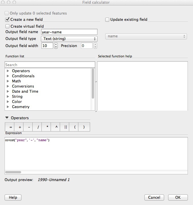
The formula we are using to create a new field is:
concat("year", '-', "name")
Here we are “concatenating” the two fields into one string of text, separating them with a hyphen. In QGIS’s Field calculator, existing fields in the data are designated by double quotes, and strings of text by single quotes. Note that you must select Text (string) for Output field type, because concatenate is a function that is valid for text strings only. Setting the Output field width to 50 ensures that none of the values get truncated.
Click OK, then click the Toggle Editing icon again and Save the change. Open the attribute table to confirm that the new field has been created.
Now click on the Points2One icon, and fill in the dialog box as follows:
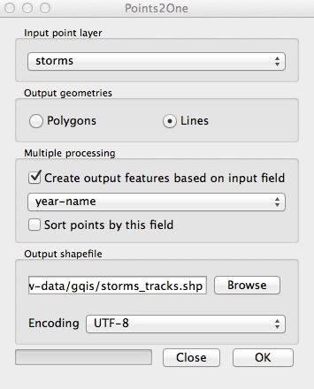
Accept the option to display on the map, which should now look like this:
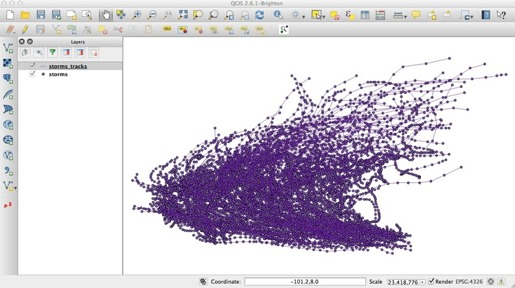
Note that most of the entries in the attribute table for the new shapefile will not be valid, as they come from just one of the points used to make each line. If you were to use this file, I suggest editing the attribute table: Use the Delete column option to remove all fields apart from year and name. You can access Delete column with the following icon:

Use hexagonal binning to summarize data on the Syrian conflict
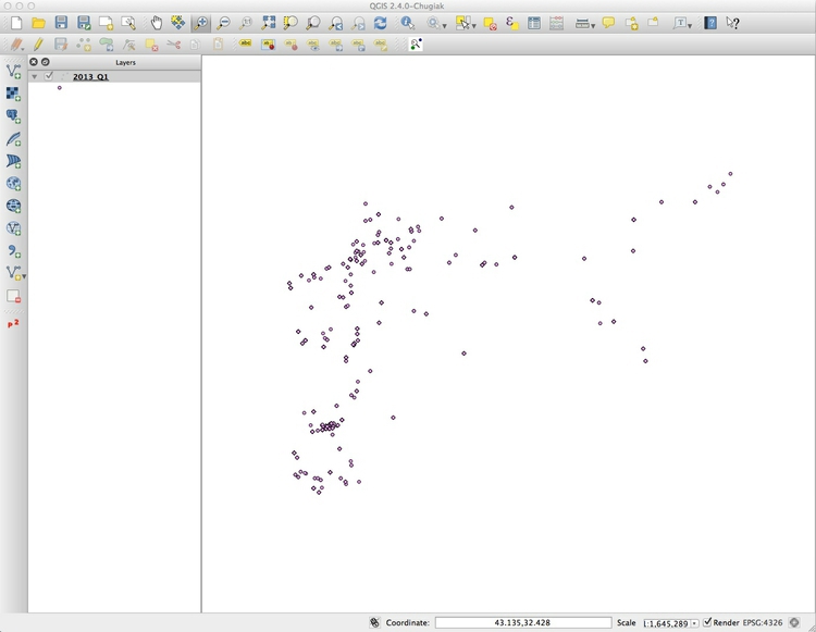
Open a new project and import the 2013_Q1 shapefile from the syria_violence subfolder. This displays violent events in Syria’s civil war from the first quarter of 2013, as displayed on this interactive, and is in a Google Mercator projection.
If you open the attribute table for this shapefile, you will see it contains more than 10,000 entries — so clearly many of the points are lying over the top of one another.
We will use the MMQGIS plugin to create a hexagonal grid over the map, and then count the number of points in each grid cell, to get a better picture of the intensity of the conflict by location.
First use the zoom and pan controls to ensure that there is a little space around the points in the displayed area, giving a view something like this:
Select MMQGIS>Create>Create Grid Layer and fill in the dialog box as follows:
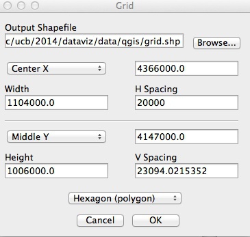
Center Xand Middle Y will by default be the longitude and latitutude for the center of the displayed area. Make sure to select Hexagon (polygon), and then set the H Spacing; V Spacing will adjust automatically. Because we are working with a shapefile in Google Mercator projection, the units will be in meters, so here we have set a horizonatal spacing for the hexagons of 20 kilometers; if we were working with an unprojected file in the WGS 84 datum, the units would be in degrees.
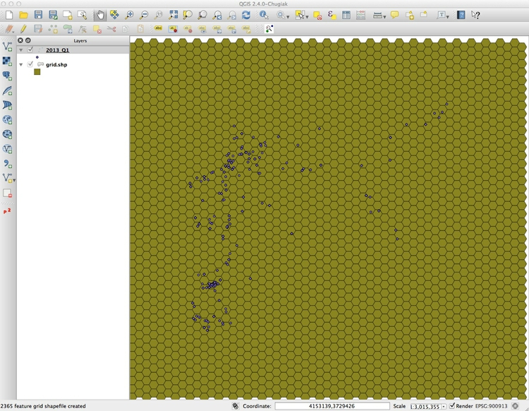
Click OK to create the grid layer, giving it the same Google Mercator projection. Drag the new grid layer under the points in the Layers panel and the map should look like this:
Now select Vector>Analysis Tools>Points in Polygon and fill in the dialog box as follows:

This will create a new shapefile with a field PNTCNT, giving the number of points in each cell in the grid. Again, give this a Google Mercator projection. Save this file in your working folder in GeoJSON format.
Save the project, as you will need it for the assignment.
Assignment
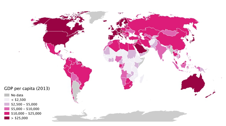
Use your GeoJSON file of 2013 GDP per capita for the world’s nations to replicate this map:
Some hints:
You will need to change to a
World_Robinson EPSG:54030projection. When you do so, you may find the map transforms to a strange series of geometric shapes. If this happens, right-click on the layer, selectProperties>Renderingand uncheckSimplify geometry.When styling the map, use a ColorBrewer sequential color scheme with 5 classes. Then use the
Add classbutton to add a class/bin for the countries with no data. Remember that these will have the value-99, so you can then set the values and labels for each bin in the data manually. Use a neutral gray for the countries with no data.You will find that Antarctica disappears from the map, as it had no value for GDP per capita. But you can add it to the map by importing the world shapefile and moving this layer beneath your styled map.