Making online maps and processing geodata with CartoDB
Introducing CartoDB
CartoDB is a cloud-based mapping application that makes it easy to produce interactive, online maps. These maps can include animations of data over time.
It is also a geospatial database, allowing you to perform GIS analyses and process geodata using Structured Query Language. If you are already familiar with working with databases, you may find CartoDB a good alternative to the point-and-click interface of QGIS for these tasks.
The data we will use
Download the data from this session from here, unzip the folder and place it on your desktop. It contains four subfolders, with the following files:
Earthquakes
quakes.csvThe same data on historical earthquakes that we worked with yesterday, i.e. all quakes with a magnitude of 5 and greater from 1964 to 2013 inclusive, in a circle with a radius of 6,000 kilometers from the center of the continental United States, with a couple of extra fields, explained below.seismic_risk.geojsonThe seismic risk data from yesterday in GeoJSON format, clipped to the borders and coastline of the continental United States.
Storms
storms_points.csvObservations on North Atlantic hurricanes and other tropical storms. This is the data in the shapefile you worked with yesterday in CSV format.storms_tracks.zipZipped shapefile showing the tracks of each storm since 1990, as you made yesterday with QGIS from the points shapefile.
SF
sf_test_addresses.csvThe same sample of geocoded addresses in San Francisco from yesterday.sfpd_stations.zipZipped shapefile with locations and other data for police stations in San Francisco, from DataSF, the city’s data portal.
Syria
syria_all.csv CSV file documenting violent events in the Syrian civil war from the start of 2011 to the end of the first quarter of 2013, derived from GDELT project data. See here for more on how these events were classified.
The folder also contains a template web page, test.html, in which you can embed maps made with CartoDB.
Map seismic risk and historical earthquakes in the continental United States
To demonstrate CartoDB’s core map-making functionality, we will first make an interactive online version of the static map we made yesterday with QGIS.
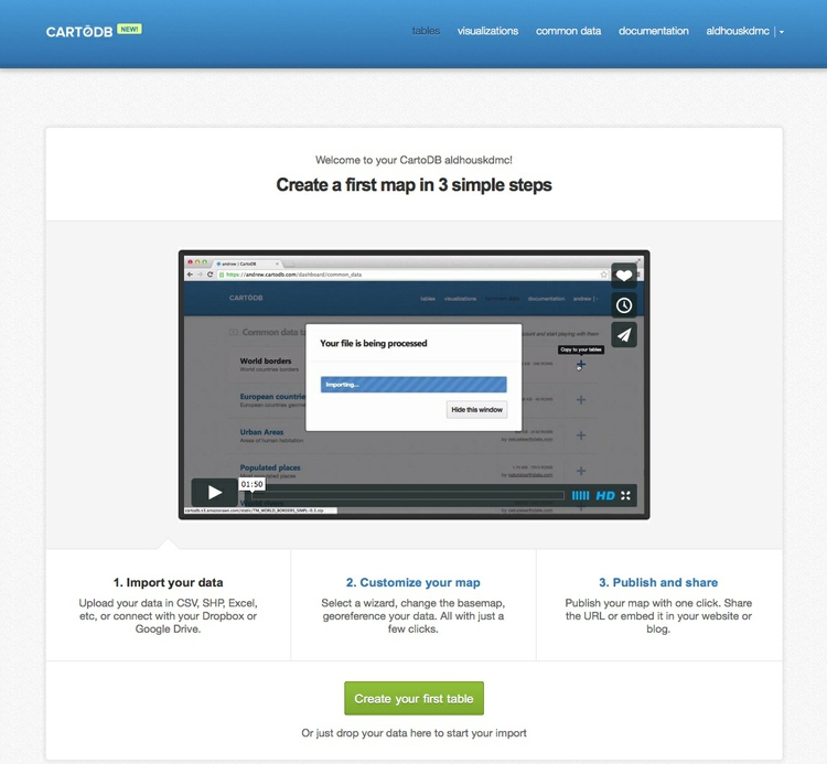
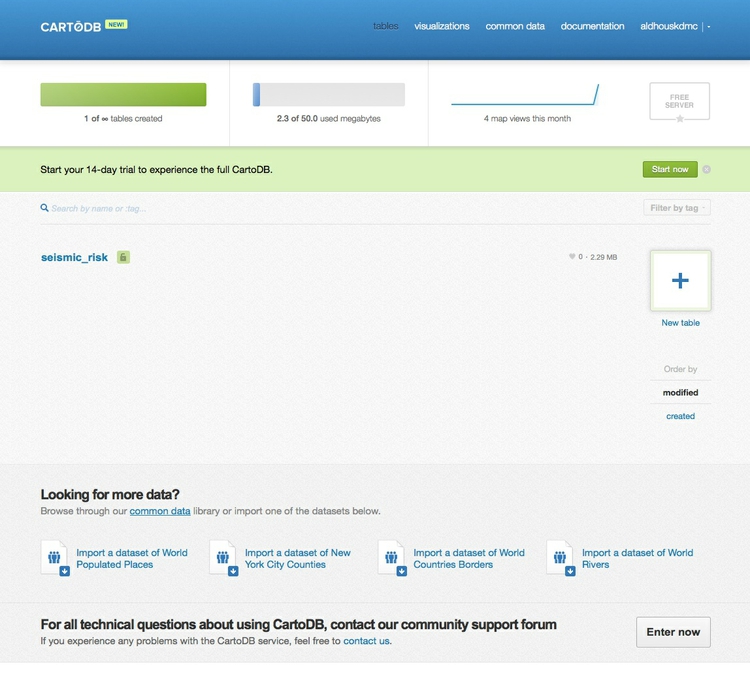
Login to a new CartoDB account, and you should see a screen like this:
Import and view the data
Click the green Create your first table button to start importing data. You will see this dialog box:
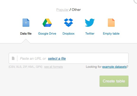
Under the Data file tab, click the select a file link, navigate to the file seismic_risk.geojson and click Open.
CartoDB can import data in a variety of formats, including CSV, KML, GeoJSON and shapefiles (which should be in a zipped folder). See here for more on imports and supported data formats.
Once the data has imported, you will see the uploaded data table in DATA VIEW:
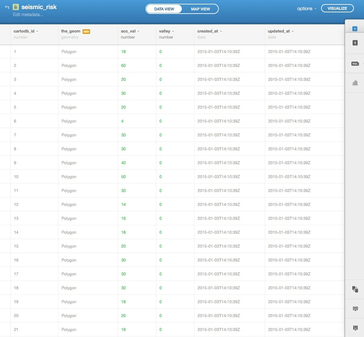
Notice that, in addition to the fields from the original data, each row has been given a cartodb_id, which is a unique identifier for each. The table also has a field called the_geom which has the tag GEO. This field is central to how CartoDB works, defining the geometry of any map you make. As in QGIS, these geometries can be points, lines or polygons — which is what we have here.
You can rename fields, sort the table by the data in them, or change their data type (for example from numbers to strings of text), by clicking the downward-pointing triangle next to the header of each.
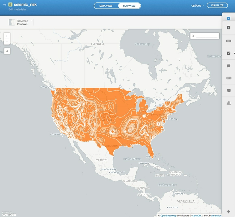
Switch to MAP VIEW to see the basic, unstyled map:
Click the small return arrow at top left to go to an overview of your tables:
Notice that the top menu also has links to visualizations (which we will explore shortly), common data and documentation. The latter has links to CartoDB’s technical manuals, while common data has links to useful datasets that you can import as tables into your own account. Take a few minutes to explore what’s there, before returning to tables.
Now click the New table button with the blue plus sign and import the file quakes.csv, which should look like this in the DATA VIEW:
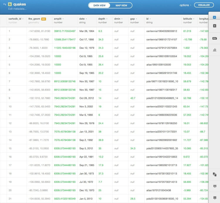
Notice that the_geom for points is given by their longitude and latitude co-ordinates.
This table also contains two fields that were not in the data we worked with yesterday: amplit and date.
date is a formatted, plain text version of the date from the full timestamp given in the time field, which we will use later in a tooltip.
amplit is a field I calculated to scale the circles by the amount of shaking caused by each quake, by raising 10 to the power of the quake magnitude values in the mag field. I then took the square root of that number, because CartoDB sets the size of circles by their width/radius, rather than their area. (As we noted in the opening session, when scaling circles using radius or diameter, we need to use the square root of the data values to get the circles to scale correctly, by area.)
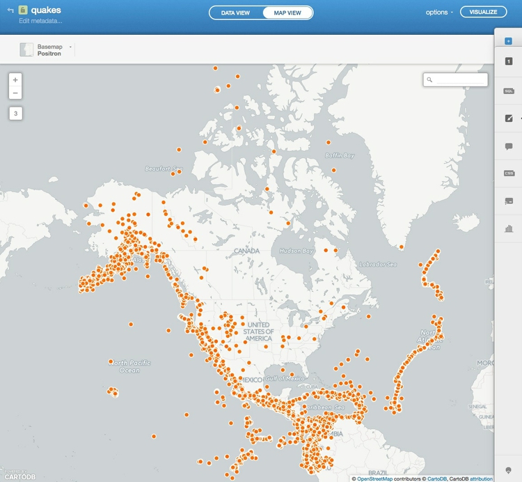
Click on the MAP VIEW to see the locations of all of the quakes:
Create a visualization combining both tables
Exit the quakes table and click on the visualizations link from the top menu. As the welcome screen explains, visualizations can be published online from your CartoDB account, and can contain up to three tables:
Click the green Create your first vizz button and Add the seismic_risk table:
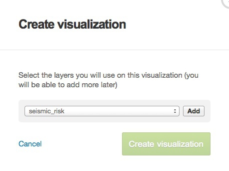
Add the quakes table as well, the then click the green Create visualization button. Give it a name, and click the green button again.
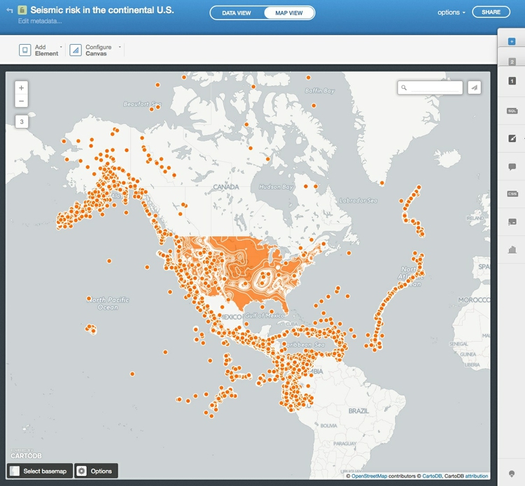
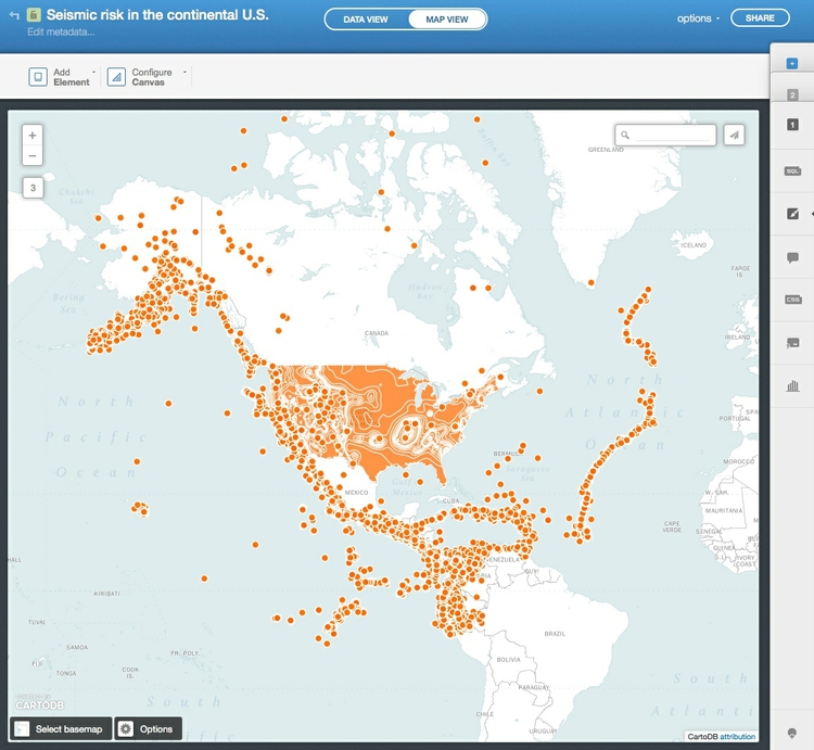
Once in the visualization, select MAP VIEW to see both layers on the same map:
Select a basemap
Choose a basemap for your visualization, by clicking Select basemap at bottom left. Take a few minutes to explore the built-in basemap options. You are not limited to these basemaps, however.
To import another tiled basemap from elsewhere on the web, click the blue plus sign next to Yours to call up the following dialog box:
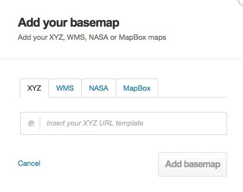
The XYZ tab allows you to call in publicly available basemaps using URLs in the following format:
https://{s}.tiles.mapbox.com/v3/mapbox.world-bright/{z}/{x}/{y}.png
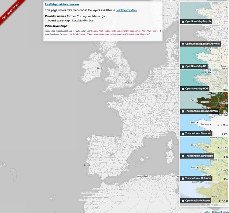
We will use this basemap, provided by MapBox (see the other basemaps from MapBox here). The Leaflet Providers preview is a good place to look for available basemaps from other providers. It previews the maps and also exposes their XYZ URLs:
Back in CartoDB, enter the XYZ URL for the MapBox world bright map and click Add basemap. The map should now look like this:
Style the maps using the CartoDB wizard
Notice that the toolbar at right has tabs numbered 1 and 2. It you hover over them, you will see that they correspond to the seismic_risk and quakes layers respectively.
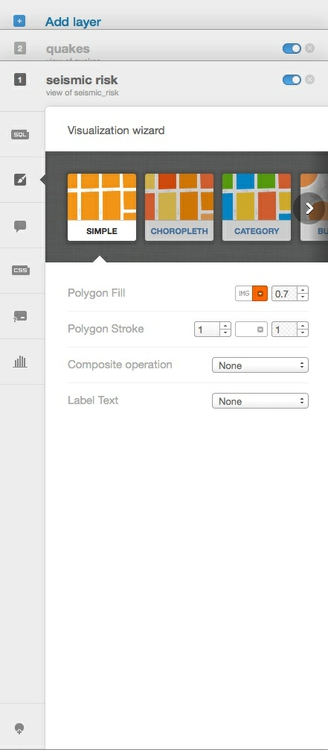
Click on 1 to expose the Visualization wizard for the seismic_risk layer, which can also be reached by clicking the paintbrush icon:
(Notice that this has also exposed blue toggle controls for each layer which can be used to turn the visibility for each on and off.)
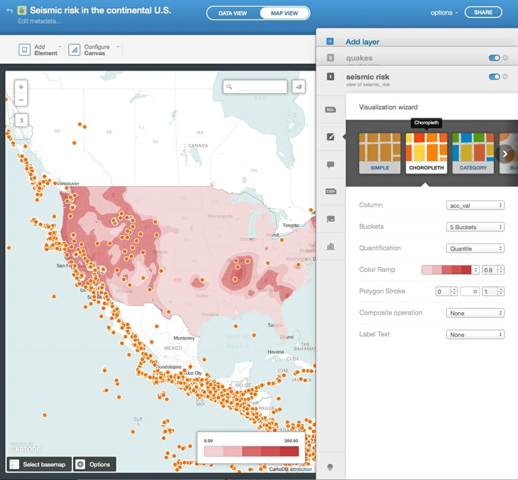
Scroll from left to right through the visualization options, and select CHOROPLETH to make a choropleth map.
Set acc_val as the data Column, select 5 Buckets, set them by Quantile and set the Polygon Stroke to zero to remove the lines from the map layer. The map should now look like this:
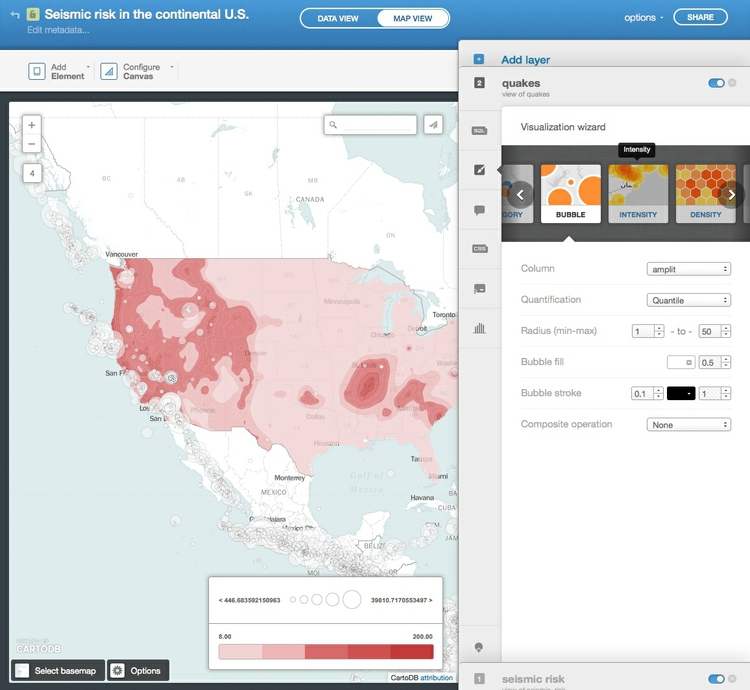
Now click 2 to switch to the quakes layer and notice that there are different visualization possibilities for point layers, which include BUBBLE, INTENSITY and DENSITY.
The last two are for aggregating the display of many points: INTENSITY provides a heatmap-like view while DENSITY performs hexagonal binning, like we did using QGIS yesterday:
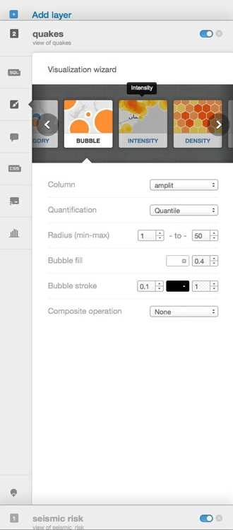
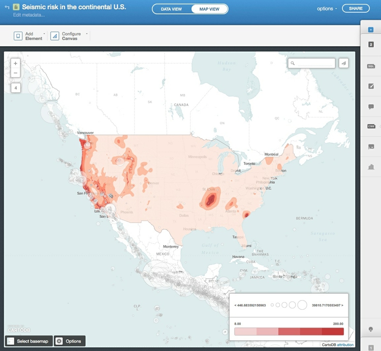
Select BUBBLE to scale the circles. Then set amplit as the data Column and Quantile for quantification. Set the Radius of the circles to run from 1 to 50 and set the Bubble fill color to white and its opacity to 0.5. Also set the Bubble stroke width to 0.1 and its color to black. The map should now look like this:
We now have a rough approximation of the map we made yesterday in QGIS, but there are important differences: We do not have the custom bins we used for the choropleth map, and the circles are not precisely scaled by area according to the amount of shaking — instead they are divided into a number of size categories over the range we prescribed.
Style the maps using CartoCSS
To exert finer control over the map styling, we can use CartoCSS, which styles maps in much the same way that conventional CSS styles web pages. See here for a good CartoCSS reference.
Switch back to the seismic_risk layer, click on the CSS icon, where you will see the following code:
/** choropleth visualization */

#seismic_risk{
  polygon-fill: #F2D2D3;
  polygon-opacity: 0.8;
  line-color: #FFF;
  line-width: 0;
  line-opacity: 1;
}
#seismic_risk [ acc_val <= 200] {
   polygon-fill: #C1373C;
}
#seismic_risk [ acc_val <= 60] {
   polygon-fill: #CC4E52;
}
#seismic_risk [ acc_val <= 30] {
   polygon-fill: #D4686C;
}
#seismic_risk [ acc_val <= 14] {
   polygon-fill: #EBB7B9;
}
#seismic_risk [ acc_val <= 8] {
   polygon-fill: #F2D2D3;
}
Edit this to the following, to reset the breaks between the bins, and to use the same color scheme we used yesterday, using HEX values taken from the ColorBrewer website.
/** choropleth visualization */

#seismic_risk{
  polygon-fill: #fee5d9;
  polygon-opacity: 0.8;
  line-color: #FFF;
  line-width: 0;
  line-opacity: 1;
}
#seismic_risk [ acc_val <= 200] {
   polygon-fill: #a50f15;
}
#seismic_risk [ acc_val < 80] {
   polygon-fill: #de2d26;
}
#seismic_risk [ acc_val < 60] {
   polygon-fill: #fb6a4a;
}
#seismic_risk [ acc_val < 40] {
   polygon-fill: #fcae91;
}
#seismic_risk [ acc_val < 20] {
   polygon-fill: #fee5d9;
}
Note that that I have also edited the operators for all but one of the formulas for the breaks from <= (less than or equal to) to < (less then). This will create the same breaks as we used in the QGIS map. Click the Apply style button at bottom right.
Now switch to the CartoCSS editor for the quakes layer, where you will find the following code:
/** bubble visualization */

#quakes{
  marker-fill-opacity: 0.5;
  marker-line-color: #000000;
  marker-line-width: 0.1;
  marker-line-opacity: 1;
  marker-placement: point;
  marker-multi-policy: largest;
  marker-type: ellipse;
  marker-fill: #FFFFFF;
  marker-allow-overlap: true;
  marker-clip: false;
}
#quakes [ amplit <= 39810.7170553497] {
   marker-width: 50.0;
}
#quakes [ amplit <= 10000] {
   marker-width: 44.6;
}
#quakes [ amplit <= 6309.57344480193] {
   marker-width: 39.1;
}
#quakes [ amplit <= 4466.83592150963] {
   marker-width: 33.7;
}
#quakes [ amplit <= 3162.27766016838] {
   marker-width: 28.2;
}
#quakes [ amplit <= 2238.72113856834] {
   marker-width: 22.8;
}
#quakes [ amplit <= 1412.53754462275] {
   marker-width: 17.3;
}
#quakes [ amplit <= 1000] {
   marker-width: 11.9;
}
#quakes [ amplit <= 707.945784384138] {
   marker-width: 6.4;
}
#quakes [ amplit <= 446.683592150963] {
   marker-width: 1.0;
}
We can greatly simplify this CartoCSS, and also make it size the circles accurately by area according to the amount of shaking, by editing to the following:
/** bubble visualization */

#quakes {
  marker-width: [amplit]/120;
  marker-fill: #ffffff;
  marker-line-color: #000000;
  marker-line-width: 0.2;
  marker-allow-overlap: true;
  marker-opacity: 0.5;
  marker-line-opacity: 1;
}
Notice that instead of the conditional code setting a total of 10 different marker-width sizes according to bins in the amplit field, data values from that field are now used directly to set marker-width by putting the field name in square brackets. Those values are then divided by 120 to give the circles a reasonable size on the map — a value I settled on through trial and error.
When styling maps in CartoDB, I recommend setting the visualization type and data columns in the wizard, accepting default options, and then switching to CartoCSS.
Configure the legend and tooltips for the quakes
The map should now look like this:
Notice that it still carries legends referring to the styling created by the wizard. So now we need to edit these.
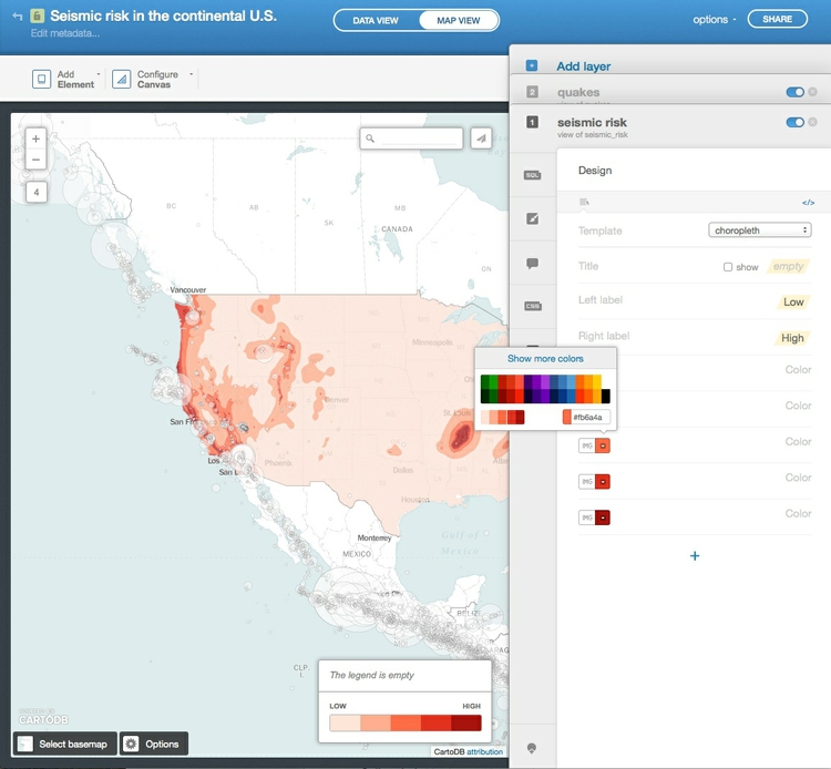
For the seismic_risk later, click on the legend icon, immediately underneath the CartoCSS editor. Change the Left label to Low and the Right label to High; then change the colors to those that are now displayed on the map:
Next click the link marked </> to expose the HTML used to create the legend. Insert a new second line and add the following, to explain what the colors are showing:
<h4>Seismic risk:</h4><br>
The quakes are best explained using text, rather than a symbol legend. Switch to legends for the quakes layer, select a custom template and again click </>, where you will find the following HTML:
<div class='cartodb-legend custom'> <div class="warning">The legend is empty</div></div>
Edit this to the following:
<div class='cartodb-legend custom' style='width:200px'>
<p>Circles show significant quakes, from 1964 to 2013, scaled by the amount of shaking. Click/tap for details.</p>
</div>
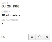
Now we will set a tooltip/information window to appear when each quake is clicked. In the quakes layer, select the infowindow icon, which looks like a speech bubble. Notice that there are options to set information to appear on both Click and Hover. In the Click tab, toggle the controls for date, depth and mag, then click on one of the quakes to see the following:
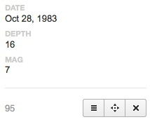
This needs editing, to spell out MAG in full as MAGNITUDE, and to give the units for depth, which are kilometers.
Back in theinfowindow editor, select the link showing a A with a pencil. Change mag to Magnitude to edit the title that appears.
Then select the </> link and edit the HTML to add the units for depth, and click Apply:
<p>{{depth}} kilometers</p>
The information window should now look like this:
Configure the map options, and publish
We are almost ready to publish the visualization, but before doing so, click Options at the bottom left of the map to select the controls and other items you want to include. Here I have disabled the Search box, which geocodes locations entered by the user and zooms to them; I have enabled both the Layer selector option, which allows users to turn the layers on and off, and an option to switch to a Fullscreen view of the map:
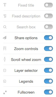
Also explore the Add Element button at top left, which allows you to add a title and other annotations to your map.
Having finished working on the visualization, click the SHARE button at top right. This will call up options to publish your visualization:
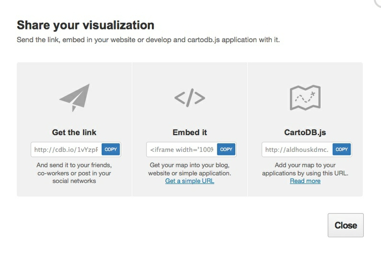
Copy the code from Embed it to obtain an iframe which will allow you to embed the map on any web page, in the following format:
<iframe width='100%' height='520' frameborder='0' src='http://aldhouskdmc.cartodb.com/viz/e7640620-935f-11e4-a70d-0e4fddd5de28/embed_map' allowfullscreen webkitallowfullscreen mozallowfullscreen oallowfullscreen msallowfullscreen></iframe>
(Note that you can edit the dimensions of the iframe — here set at 100% of the width of the div in which it appears — and 520 pixels high) as required.)
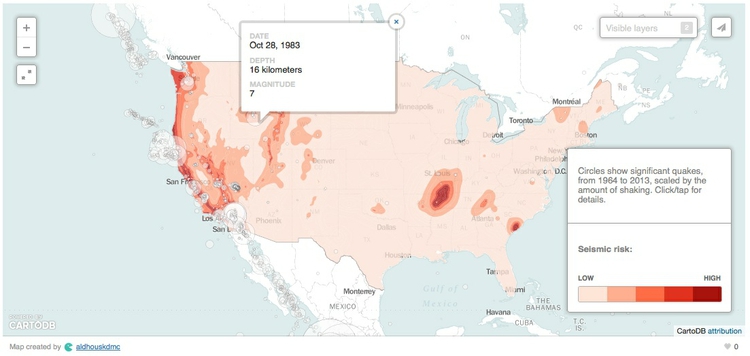
Open the file test.html in your text editor, paste the iframe code between the <body> </body> tags and save the file. Then open in a web browser to see the completed map:
Map hurricanes and other North Atlantic tropical storms
Make an animated map of storm observations
To explore CartoDB’s ability to animate maps over time, and to start applying SQL queries to our maps, we will now work with the North Atlantic storms data, producing a visualization of the 2005 hurricane season — the busiest and most destructive on record.
In CartoDB, navigate to your tables and import the file storms_points.csv. In the DATA VIEW, notice the fields timestamp, giving the data and time of each observation, and the year. We will use these fields shortly.
Now click on the VISUALIZE button at top right to create a visualization from this table, calling it Animated storms.
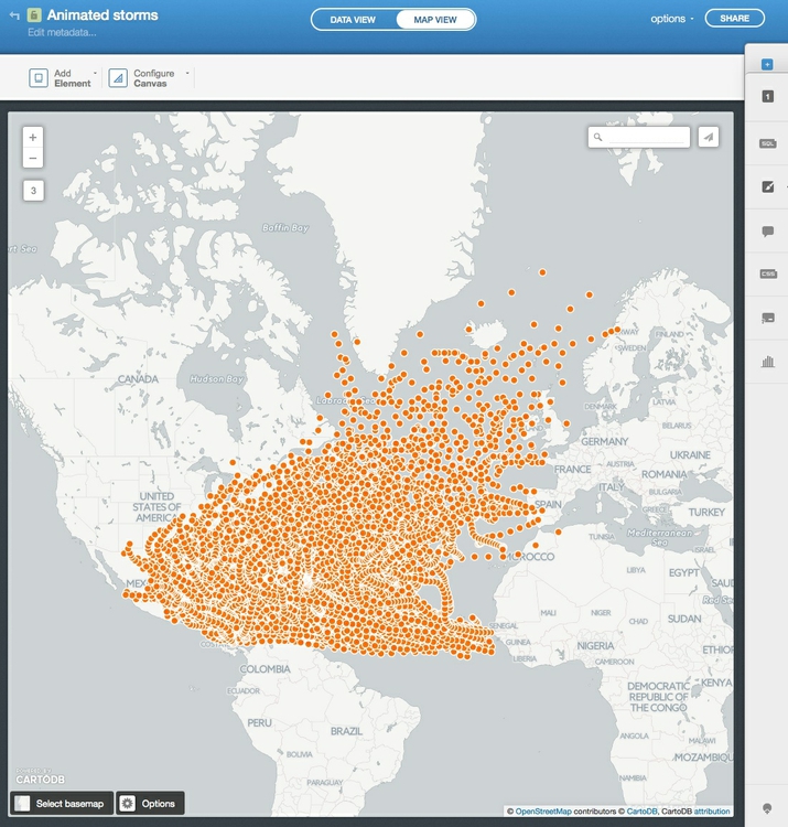
In the visualization, switch to the MAP VIEW to see alll of NOAA’s observations of North Atlantic storms from 1990 to 2013 plotted on the map:
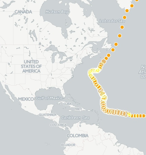
Open the visualization wizard, and select the TORQUE option. Notice that the map immediately becomes animated, with circles rushing across the screen leaving ghosts of themselves behind:
In the Visualization wizard set the Torque options to the following:
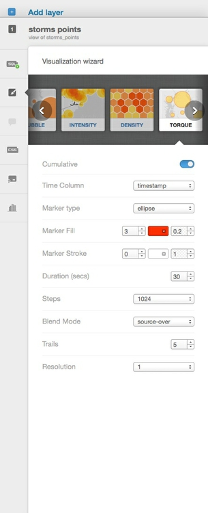
Here is what these options do:
CumulativeToggling this on means that circles stay on the screen once they appear.Time ColumnThis selects the data used to animate the map. Setting it totimestampcauses that field to be used, and the corresponding dates to appear in the play/slider control at the bottom of the map.Marker typeChooseellipse(for circles) orrectangle.Marker fillThe left value defines the size of each marker, the right its opacity; you can also select a color.Marker strokeSimilar controls for the border round each marker; set the left value to zero for no border.DurationThe total duration of the animation.StepsThe total number of frames in the animation.Blend ModeThis controls rendering of markers that appear over the top of one another. Experiment with the options to see their effects.TrailsThese control the ghostly shadows left behind by the moving markers. We will see how they work when we edit the CartoCSS for this visualization.ResolutionThe precision with which markers are mapped to their co-ordinates;1gives the highest precision.
Now switch to the CartoCSS editor, where you will see the following code:
/** torque visualization */

Map {
-torque-frame-count:1024;
-torque-animation-duration:30;
-torque-time-attribute:"timestamp";
-torque-aggregation-function:"count(cartodb_id)";
-torque-resolution:1;
-torque-data-aggregation:cumulative;
}

#storms_points{
  comp-op: source-over;
  marker-fill-opacity: 0.2;
  marker-line-color: #FFF;
  marker-line-width: 0;
  marker-line-opacity: 1;
  marker-type: ellipse;
  marker-width: 3;
  marker-fill: #FF2900;
}
#storms_points[frame-offset=1] {
 marker-width:5;
 marker-fill-opacity:0.1;
}
#storms_points[frame-offset=2] {
 marker-width:7;
 marker-fill-opacity:0.05;
}
#storms_points[frame-offset=3] {
 marker-width:9;
 marker-fill-opacity:0.03333333333333333;
}
#storms_points[frame-offset=4] {
 marker-width:11;
 marker-fill-opacity:0.025;
}
#storms_points[frame-offset=5] {
 marker-width:13;
 marker-fill-opacity:0.02;
}
The conditional styles for frame-offset=1 and so on were created by the Trails option in the wizard. For the five animation frames after the marker was at given position, the marker draws new circles at that location which become progressively larger and less opaque. Edit the CartoCSS to the following, so that the circles drawn as trails are a little smaller, then click Apply style:
/** torque visualization */

Map {
-torque-frame-count:1024;
-torque-animation-duration:30;
-torque-time-attribute:"timestamp";
-torque-aggregation-function:"count(cartodb_id)";
-torque-resolution:1;
-torque-data-aggregation:cumulative;
}

#storms_points{
  comp-op: source-over;
  marker-fill-opacity: 0.2;
  marker-line-color: #FFF;
  marker-line-width: 0;
  marker-line-opacity: 1;
  marker-type: ellipse;
  marker-width: 3;
  marker-fill: #FF2900;
}
#storms_points[frame-offset=1] {
 marker-width:4;
 marker-fill-opacity:0.1;
}
#storms_points[frame-offset=2] {
 marker-width:5;
 marker-fill-opacity:0.05;
}
#storms_points[frame-offset=3] {
 marker-width:6;
 marker-fill-opacity:0.03333333333333333;
}
#storms_points[frame-offset=4] {
 marker-width:7;
 marker-fill-opacity:0.025;
}
#storms_points[frame-offset=5] {
 marker-width:8;
 marker-fill-opacity:0.02;
}
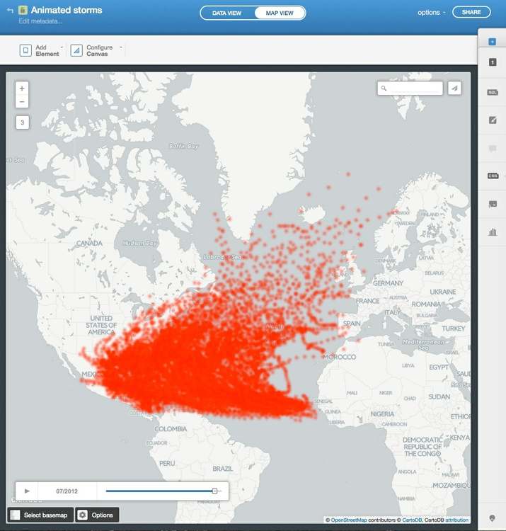
The map should now look like this:
Filter the map to show only storms from 2005
CartoDB has a filters control, which looks like a column chart and appears beneath the legends control. However, we will use the SQL control to filter the data by writing a database query.
If you have worked peviously with Structured Query Language, you will recognize queries to filter data in the following format:
SELECT field1, field2
FROM tablename
WHERE field1 = 'example'
ORDER BY field2 DESC
If field1 in a table called tablename contains text and field2 contains numbers, this query would only return records from these two fields for which the text in field1 is example, and put those records in descending order of the values in field2, i.e. from largest to smallest.
The next query would select records from the table where the values in field2 are greater or equal to 100, and then put them in alphabetical order for the text values in field1.
SELECT field1, field2
FROM tablename
WHERE field2 >= 100
ORDER BY field1
Switch the the SQL control, where you will find the following default query:
SELECT * FROM storms_points
* is a wildcard character that returns all of the fields from a table — so this query is selecting all of the data from the storms_points table
Edit the query to the following, which will select data for the storms that occurred in 2005 only, then Apply query:
SELECT * FROM storms_points WHERE year = 2005
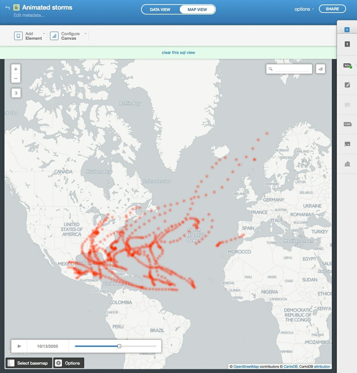
Notice that the map is now displaying only storms from 2005, and the dates on the play/slide control have narrowed accordingly:
Make a map of complete storm tracks
In this afternoon’s session, we will make a map combining this animation with a map of complete storm tracks, which we will set up for users to filter dynamically in their web browser, to see all storm tracks from 1990 to 2013, or just those in 2005.
To make this map, go to your tables and import the storms_tracks zipped shapefile. In the DATA VIEW notice that Line appears for each entry in the_geom field.
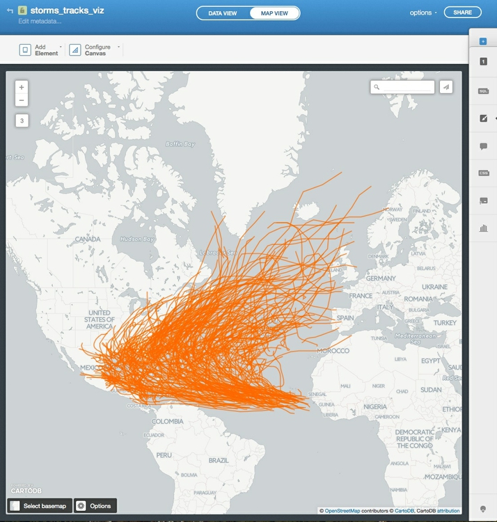
Click the VISUALIZE button to make a visualization from this table, calling it storms_tracks_viz. Switch to the MAP VIEW to see all of the tracks on the map:
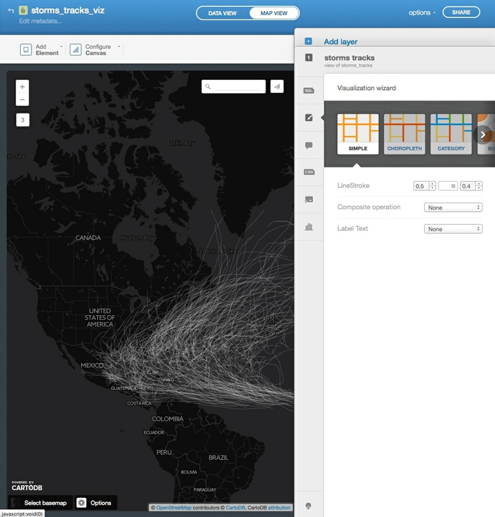
The map we will later make with this visualization will use a dark basemap, so click Select basemap at bottom left and select CartoDB>Dark Matter so we can style the tracks accordingly.
In the visualization wizard, select the SIMPLE option. Set LineStroke size to 0.5, color to white and opacity to 0.4, so the map looks like this:
Process geodata and perform geospatial analysis using SQL
CartoDB isn’t just a database — it is a “spatially aware” database that you can query to process geotdata, calculate distances or areas, and perform other geospatial analyses. This is achieved using PostGIS, an extension to the open-source PostgreSQL database that drives CartoDB.
Create buffers around geocoded addresses
For the rest of this session, we will get a taste of working with PostGIS, firstly by repeating our QGIS task of creating a buffer around the sample of San Francisco addresses.
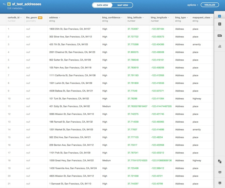
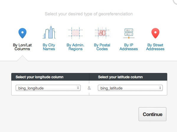
Go to your tables and import the table sf_test_addresses.csv, which we geocoded yesterday. It will initially import with the_geom field containing null values, because there are no fields unambiguously labelled longitude and latitude:
Click on the downward-pointing triangle on the header for the bing_latitude or bing_longitude, then select those field as geographic co-ordinates and click Continue:
After checking that the_geom has been populated with those co-ordinates for the points, select options at top right, Duplicate table... and call it buffer.
Click the VISUALIZE button, name the visualization SF PostGIS.
Then switch to MAP VIEW and zoom to San Francisco:
From now on were are going to work with queries that use PostGIS spatial functions, which all have the prefix ST_. Open the SQL editor and replace the default query with the following:
UPDATE buffer SET the_geom = ST_Buffer(the_geom::geography, 304.8)::geometry
This changes the map so that instead of points, we now have circles drawn around each of the points with a radius of 1,000 feet, or 304.8 meters:
Let’s break this query down to understand how it works. First, note that it is an UPDATE query, so rather than selecting records from a table, it is actually changing the table. The change being made is to SET the field the_geom using the PostGIS function ST_Buffer, which draws a buffer around an object using the value specified in meters.
That’s all fairly easy to understand, but why does the query contain ::geography and ::geometry? These are data conversions that are necessary for the buffers to be drawn. CartoDB stores the_geom in an unprojected WGS84 datum, for which the units are degrees. The conversion from this geometry to geography is necessary for calculations to be made in meters. Once the buffer has been calculated, the data must be converted back to geometry to update the table in the database.
This query reverses the process, turning each circle into a point at its center:
UPDATE buffer SET the_geom = ST_Centroid(the_geom)
Try it out, then use the first query again to return to the buffered points. If you switch to the DATA VIEW, you will see that the values in the_geom are now Polygon rather than point coordinates.
Now we will dissolve all of these separate circles into a single buffer layer. Open the SQL editor once more and replace the default query with this:
SELECT ST_Union(the_geom_webmercator) AS the_geom_webmercator
FROM buffer
ST_Union is a function that dissolves multiple geometries into one, but why does this query use the_geom_webmercator rather than the_geom? This is a quirk of CartoDB, which stores a projected version of the table’s geometry in a “hidden” field of this name, as explained here. Some PostGIS functions will only work on this version of the geometry, but CartoDB should warn you when this is necessary — try running the same query using the_geom and you should be prompted to use the_geom_webmercator.
In the data view, you will notice that there is now just a single field, called the_geom_webmercator, containing one Polygon. If you switch to the map view, you will see that the separate circles have now dissolved together:
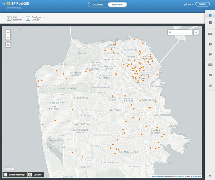
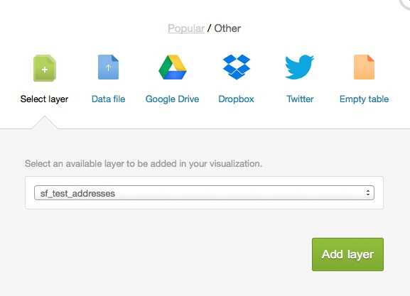
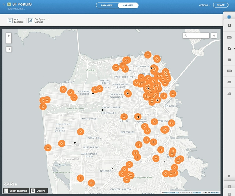
Now select Add layer from the top of the right toolbar and add the original sf_test_addresses table to the map using the Select layer tab:
Select Add layer again and import the zipped shapefile sfpd_stations using the Data file tab. Then use the Simple option in the Visualization wizard to color the points denoting the locations of San Francisco police stations black. The visualization, with its three layers, whould now look like this:
Next we are going to run a query to calculate the distance from each of the geocoded addresses to the nearest police stations. But first we need to create a new field called distance in the sf_test_addresses field to hold the results of this query.
Select this layer in from the right toolbar, switch to DATA VIEW then click on the downward-pointing trangle in any of the field headers and select Add new column.... Fill in the dialog box as follows and click Create column:
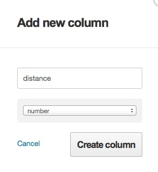
The new column will appear in the table, but all its values will be null.
Now select the SQL editor and apply this query:
UPDATE sf_test_addresses SET distance = (
  SELECT ST_Distance(
            sf_test_addresses.the_geom::geography,
            sfpd_stations.the_geom::geography
          )
  FROM sfpd_stations
  ORDER BY sf_test_addresses.the_geom <-> sfpd_stations.the_geom
  LIMIT 1
)
The distance field should now have been populated with numbers, representing the distance in meters from that address to the nearest police station.
ST_Distance is fairly straightfoward, and you will recognize why the_geom fields must be converted to geography so that distances can be calculated in meters. This time they do not need to be converted back to geometry because neither of the the_geom fields is being updated by the query.
The really clever part is this:
ORDER BY sf_test_addresses.the_geom <-> sfpd_stations.the_geom
LIMIT 1
This is performs an indexed nearest neighbor search. <-> measures the distance to each police station from each address, and then ORDER BY sorts these distances in ascending order, nearest first. Finally, LIMIT 1 returns only the first value, which is the distance to the nearest police station from each address.
What if you want those distances in miles, rather than meters? One meter is 0.000621371 miles, so simply edit the query to include this conversion:
UPDATE sf_test_addresses SET distance = (
  SELECT (ST_Distance(
            sf_test_addresses.the_geom::geography,
            sfpd_stations.the_geom::geography
          ))*0.000621371
  FROM sfpd_stations
  ORDER BY sf_test_addresses.the_geom <-> sfpd_stations.the_geom
  LIMIT 1
)
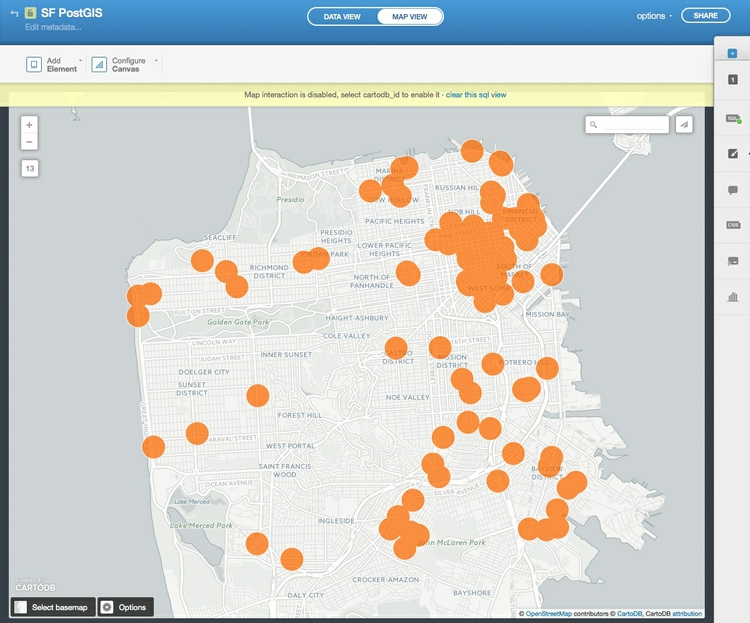
Now switch to the MAP VIEW and toggle distance to appear in a tooltip on Hover using the infowindow editor. Hover over a few points to read the values, and confirm to your statisfaction that the query has worked correctly.
Next steps with PostGIS
I hope these queries have whetted your appetite to learn more about PostGIS. I suggest continuing with the NICAR workshop, which provides some more examples of queries, and how they have been used by news media to generate stories and visualizations.
Assignment
Import the file syria_all.csv into CartoDB and create a visualization from it to produce a hexagonal binned map. Then run a query to filter the data to show only violent events in the first quarter of 2013. Having got this query to work, clear it once again to show all of the data.
Hint:
- your
WHEREclause should include dates, given in single quotes, inYYYY-MM-DDformat. When filtering by dates, you can ask for recordsBETWEENone dateANDanother.
When you have finished processing geodata in CartoDB to your satisfaction, you can export that data in various formats by selecting options>Export... from top right.
Further reading/resources
CartoDB tutorials
CartoDB maintains a good set of tutorials, organized by level of difficulty.
CartoDB/PostGIS workshop from NICAR 2014 meeting
Introduction to PostGIS and CartoDB from Andrew Hill of Vizzuality, the company behind CartoDB, and data journalist Michael Keller. From the annual meeting of the National Institute for Computer-Assisted Reporting.
Introduction to PostGIS
Detailed series of tutorials, from Boundless. While this uses the OpenGeo Suite, rather than CartoDB, the lessons should be transferrable — but note that the OpenGeo Suite uses the field name geom rather than cartoDB’s the_geom.