Making interactive maps with Carto
Introducing Carto
Carto is a cloud-based mapping application that makes it easy to produce interactive, online maps. These maps can include animations of data over time. It is also a geospatial database, allowing you to process geodata using Structured Query Language.
Learning SQL is beyond the scope of this class, but these notes include a couple of simple queries, to filter data and update a dataset with a new calculated variable.
This tutorial uses the latest upgrade to the Carto interface, known as Builder. (Here is an equivalent tutorial for the previous interface, which will soon be phased out.)
The data we will use
Download the data for this session from here. It contains the following files:
ca_counties_medicare.zipZipped shapefile with data on Medicare reimbursement per enrollee by California county in 2012, from the Dartmouth Atlas of Healthcare.healthcare_facilities.csvLocations and other data for hospitals and other healthcare facilities in California, from the California Department of Public Health. I have geocoded those facilities that lacked latitude and longitude coordinates in the raw data.
Our mapping task
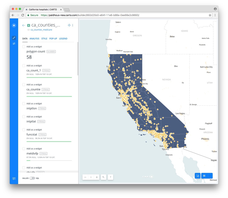
We are going to make a map with two layers:
- Choropleth map showing the Medicare spending per enrollee for care in hospitals and skilled nursing facilities, for each of the 58 counties in California. This data is in the field
hospitalin theca_counties_medicareshapefile. - A map of scaled circles, from the
healthcare_facilities.csvdata, showing the location andcapacityin beds of hospitals and skilled nursing facilities in California. We will also color the facilities by theirtype(general acute care hospital or skilled nursing facility).
Import data to Carto
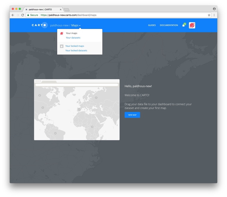
Login to your Carto account, open the drop-down menu under Maps at top left and switch to Your datasets:
Then click the NEW DATASET button at top right.
You should now see the following screen:
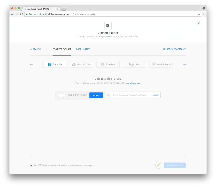
With the Data file tab selected, click the Browse button, navigate to the zipped ca_counties_medicare.zip shapefile and click Open. Then click the CONNECT DATASET button at bottom right.
Carto can import geodata in a variety of formats, including CSV, KML, GeoJSON and zipped shapefiles.
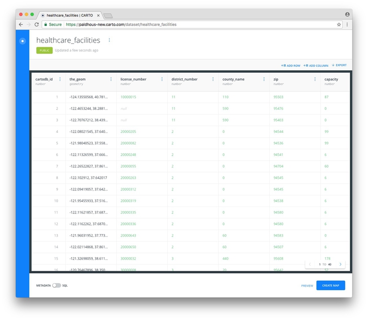
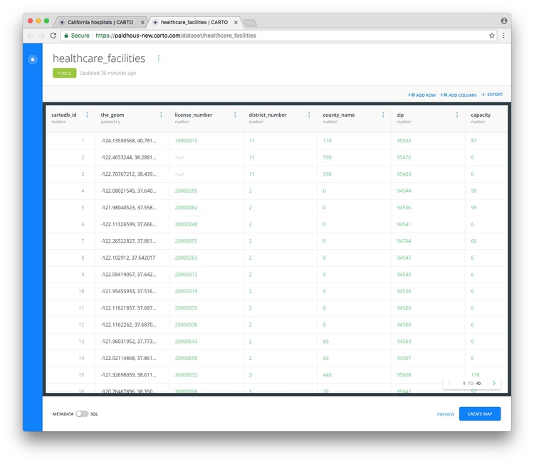
Once the data has imported, you will see the uploaded data table:
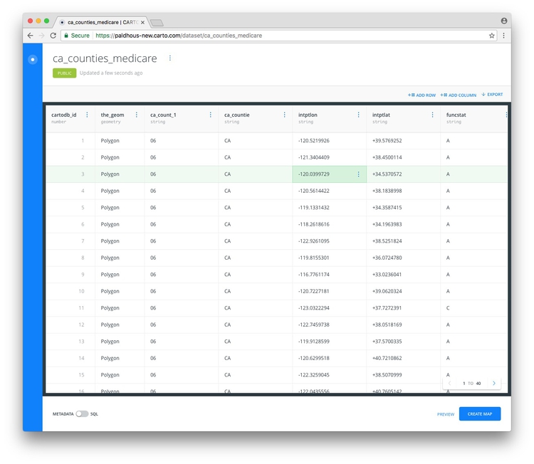
Notice that, in addition to the fields from the original data, each row has been given a cartodb_id, which is a unique identifier for each. The table also has a field called the_geom. This field is central to how Carto works, defining the geometry of any map you make. These geometries can be points, lines or polygons (areas) — which is what we have here.
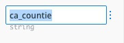
You can rename fields by double-clicking on their names:
You can sort or order the table by the data in each field by clicking on the blue dots and then using the arrows:
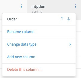
And you can change the data type for each field (for example from numbers to strings of text), using the same menu.
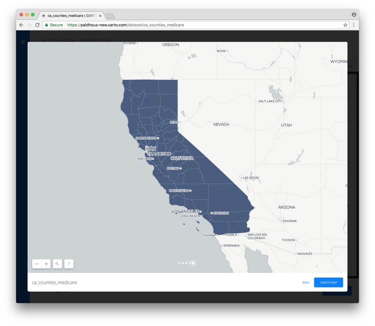
Click PREVIEW at bottom right to see the basic, unstyled map:
Now click BACK to close that map and click on the circle at top left to return to your datasets:

Notice that the top menu has a link to DOCUMENTATION, which has links to Cato’s technical manuals. The DATA LIBRARY link contains useful datasets that you can import into your own account. Take a few minutes to explore what’s there, before returning to your DATASETS.
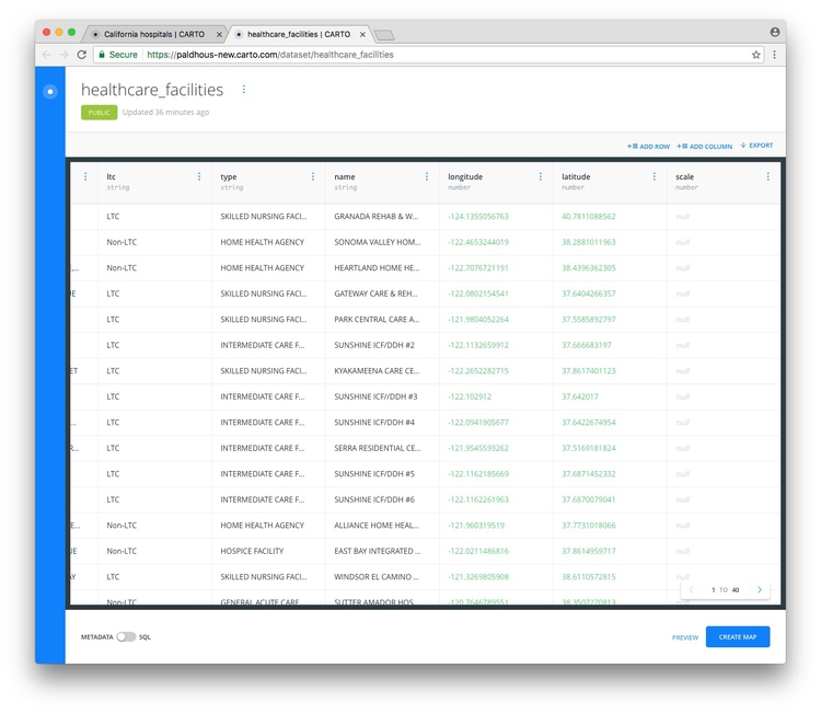
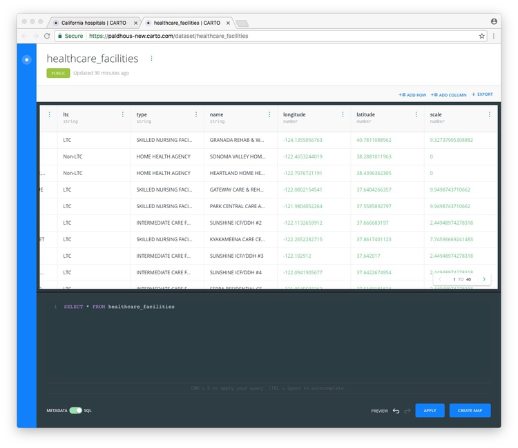
Now click the NEW DATASET button again and import the file healthcare_facilities.csv, which should look like this:
Notice that the_geom for points is given by their longitude and latitude co-ordinates.
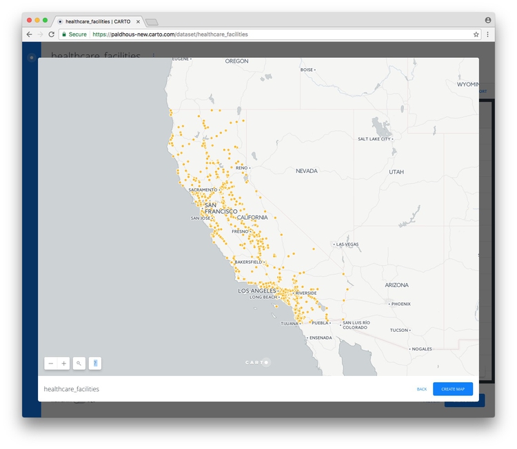
Click PREVIEW to see the locations of all of the facilities:
Create a map combining both datasets
Exit the healthcare_facilities map and reopen the ca_counties_medicare dataset by clicking on its name in your DATASETS. Then click the CREATE MAP button at bottom right.
If this is your first time using the news Carto Builder interface, you will be asked if you want to TAKE A TOUR. Instead click EDIT YOUR MAP:
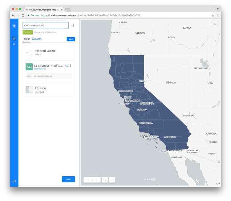
Rename this map California hospitals by clicking on its name at top left:
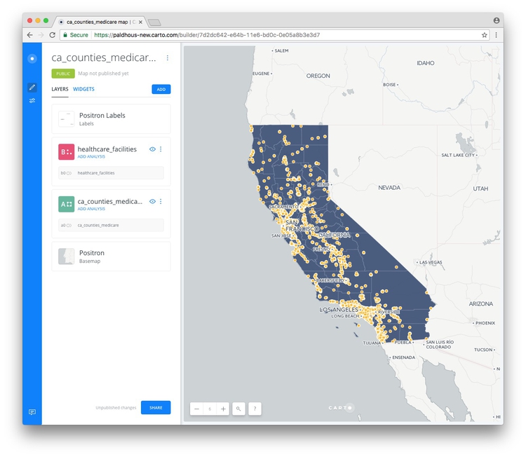
Now add the healthcare_facilities to the map, by clicking on the ADD button. Select the healthcare_facilities layer so that it is highlighted in blue, then click the ADD LAYER button at bottom right.
You should now see both layers on the same map:
Select a basemap
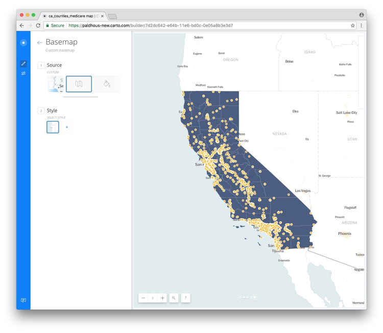
Now choose a basemap for your visualization, by clicking the Basemap layer in the left panel. The default is a basemap from Carto called Positron, with the Labels displayed over the data layers.
This is a good default choice. Take a few minutes to explore the built-in basemap options using the Source and Style options. You are not limited to these basemaps, however.
To import another tiled basemap from elsewhere on the web, click this icon under Source:

Now click the blue plus sign under Style to call up the following dialog box:
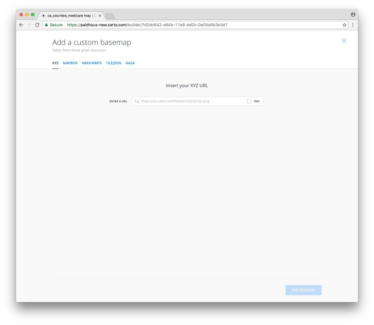
The XYZ tab allows you to call in publicly available basemaps using URLs in the following format:
https://{s}.tiles.mapbox.com/v3/mapbox.world-bright/{z}/{x}/{y}.png
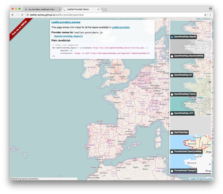
We will use this “world bright” basemap, provided by MapBox (see the other basemaps from MapBox here). The Leaflet Providers preview is a good place to look for available basemaps from other providers. It previews the maps and also exposes their XYZ URLs:
Back in Carto, enter the XYZ URL for the MapBox world bright map, above, and click Add basemap. The map should now look like this:
You can also replace the basemap with a white or colored background by clicking on the paint-pot icon under Source:

Return to the main layers panel by clicking on the backward-pointing arrow next to Basemap.
Create a new column in the healthcare facilities data to scale the circles accurately by area, according to their capacity in beds
We want to accurately and continuously vary the area of the healthcare facility according to their capacity. To achieve that, we need to create a new column in the data, containing the square root of the values in the capacity column.
This is because web-based applications like Carto set the size of circles by their width, or twice their radius. From day 1, you should remember that we need to scale by the square root of the radius to size circles so that their area is proportional to values in the data.
Open the healthcare_facilities layer, then click the blue healthcare_facilities link to open the dataset in a new browser tab:
Click ADD COLUMN, rename it as scale and then change its type from string to number:
Slide the METADATA/SQL control at bottom left to SQL to see the following view:

Enter the following query in place of the default text:
UPDATE healthcare_facilities SET scale=sqrt(capacity)
Now click APPLY.
UPDATE queries change the data in the table, in this case updating the healthcare_facilities table to set the values for scale as the square root of the values in capacity.
The scale column should have now been populated with values:
Having confirmed that the new column has been created, close the browser tab showing the dataset.
Style the maps using the point-and-click interface
Back in your map, temporarily hide the healthcare_facilities layer by clicking on its eye icon:

Now click on the ca_counties_medicare layer to bring up this view:
At this point, rename the layer Medicare spending per enrollee.
Click on STYLE, then the color bar for FILL. Then select BY VALUE and select the hospital field to color the map by the values for Medicare spending per enrollee for care in hospitals and skilled nursing facilities:
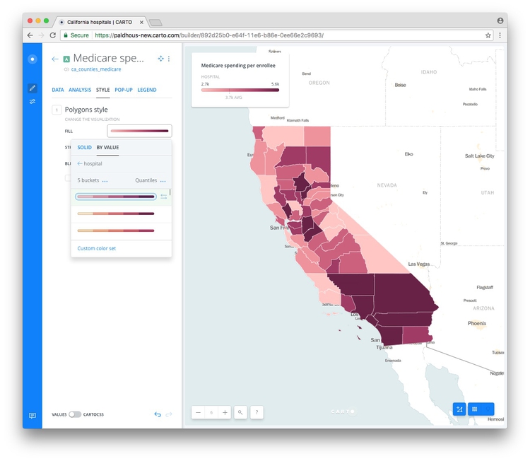
The default options divide the data into 5 buckets, or bins, using quantiles, as we discussed in day 1. You can explore other options by clicking the three blue dots next to each. You can also select from a range of color palettes, and add labels to your map if desired by checking that box.
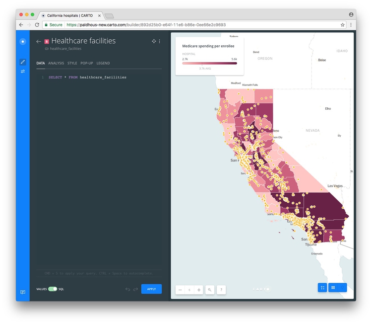
Return to the main layers panel, and restore the visibility of the healthcare_facilities layer by clicking on its eye icon.
Click on the layer, and rename to Healthcare facilities.
Before we style this layer, we need to filter it to show only the two types of facilities we are interested in, GENERAL ACUTE CARE HOSPITAL and SKILLED NURSING FACILITY.
In the DATA tab, slide the VALUES/SQL control at bottom to SQL to see the following:
To filter the data, we can use a simple SQL query. Enter the following in place of the default query, then click APPLY:
SELECT *
FROM healthcare_facilities
WHERE type = 'GENERAL ACUTE CARE HOSPITAL' OR type = 'SKILLED NURSING FACILITY'
In this query, * is a wildcard that selects every column from the healthcare_facilities dataset. The WHERE clause applies the filter for the specific types we want to retain on the map.
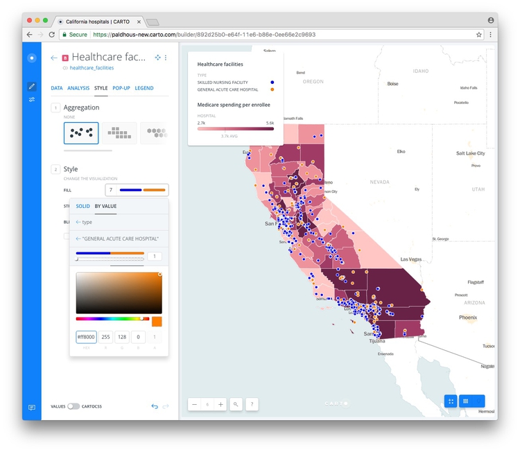
Now switch to the STYLE tab, as before. Retain the default aggregation of NONE, and click on the color bar for FILL, then BY VALUE. Select type and the points should be colored using a default qualitative color scheme.
Click on the color bar for FILL, and then the individual color bars to edit the colors used. Here I have selected a HEX value of #0000FF to make each SKILLED NURSING FACILITY blue, and #FF8000 to make each GENERAL ACUTE CARE HOSPITAL orange:
(The different aggregation options allow you to create other map types from a points layer, including animations. We will explore these options in the workshop, as time allows.)
Style the map using CartoCSS
To exert finer control over the map styling, we can use CartoCSS, which styles maps in much the same way that conventional CSS styles web pages. See here for a CartoCSS reference.
Return to the main layers panel, select the Medicare spending per enrolle layer and then STYLE. Now slide the VALUES/CARTOCSS control at bottom to CARTOCSS
You should see the following code:
#layer {
  polygon-fill: ramp([hospital], (#ffc6c4, #ee919b, #cc607d, #9e3963, #672044), quantiles);
  line-width: 1;
  line-color: #FFF;
  line-opacity: 0.5;
}
You can edit the colors by replacing the HEX values, here adopting a ColorBrewer Reds palette, and reducing the opacity of the polygons to 70%.
#layer {
  polygon-fill: ramp([hospital], (#fee5d9, #fcae91, #fb6a4a, #de2d26, #a50f15), quantiles);
  line-width: 1;
  line-color: #FFF;
  line-opacity: 0.5;
  polygon-opacity: 0.7;
}
Click APPLY and the map and legend should redraw:

Now switch to the Healthcare facilities layer, select STYLE and again switch to the CARTOCSS view, where you will find the following code:
#layer {
  marker-width: 7;
  marker-fill: ramp([type], (#0000ff, #ff8000), ("SKILLED NURSING FACILITY", "GENERAL ACUTE CARE HOSPITAL"), "=");
  marker-fill-opacity: 0.5;
  marker-allow-overlap: true;
  marker-line-width: 1;
  marker-line-color: #FFF;
  marker-line-opacity: 1;
}
Edit this to the following:
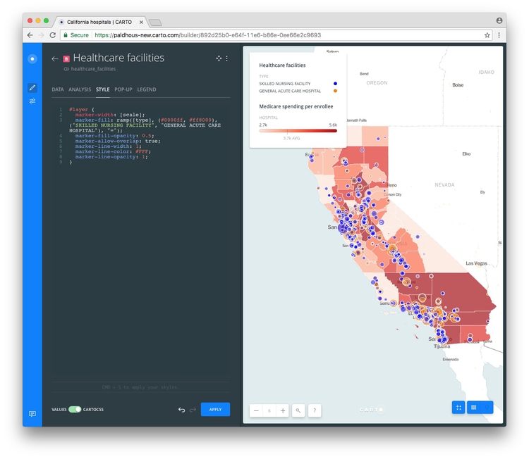
#layer {
  marker-width: [scale];
  marker-fill: ramp([type], (#0000ff, #ff8000), ("SKILLED NURSING FACILITY", "GENERAL ACUTE CARE HOSPITAL"), "=");
  marker-fill-opacity: 0.5;
  marker-allow-overlap: true;
  marker-line-width: 1;
  marker-line-color: #FFF;
  marker-line-opacity: 1;
}
Setting the marker-width to [scale], with the name of the field in square brackets, accurately scales the area of the circles according the capacity of the facilities. If necessary, when scaling circles in this way, you can use multiplication (marker-width: [scale]*2;) or division (marker-width: [scale]/2;) to increase or decrease the size of all the circles.
Click APPLY and the map should look like this:
Edit the legend to add dollar symbols
Select the Medicare spending per enrollee layer and then the LEGEND tab. Check PREFIX and type $ to set the units for the legend as dollar values.
Configure tooltips/pop-ups
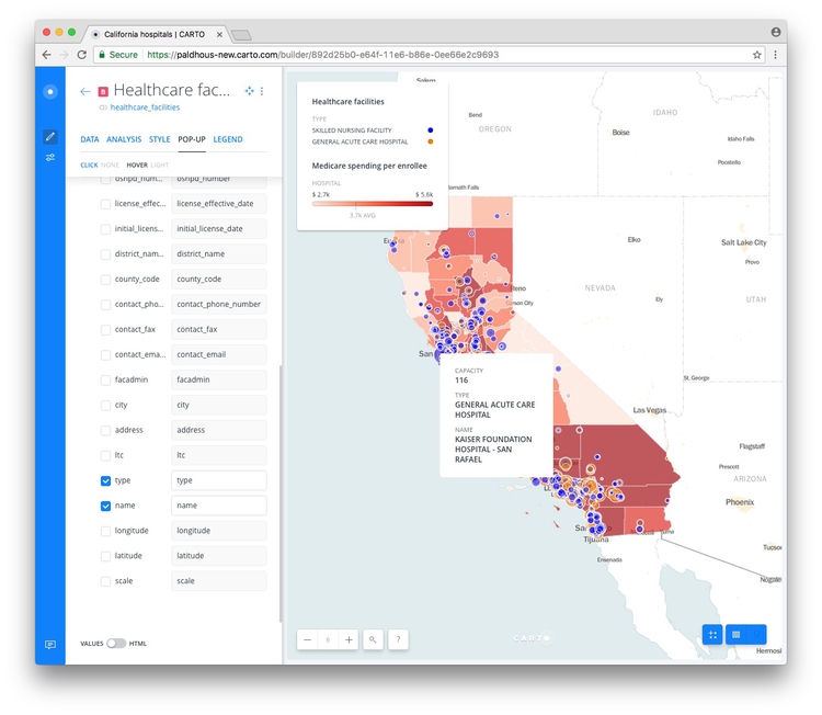
Switch to the Healthcare facilities layer and select the POP-UP tab. Select Hover and the LIGHT style, and check capacity, type, and name.
When you hover over one of the facilities, the map should now look like this:
Configure the map options, and publish
Return to the main layers panel.
We are almost ready to publish the visualization, but before doing so, click the Settings icon at left:

Here the SEARCH BOX, which geocodes locations entered by the user and zooms to them is disabled; the LAYER SELECTOR, which allows the indivisual layers to be swithced on and off, is enabled:
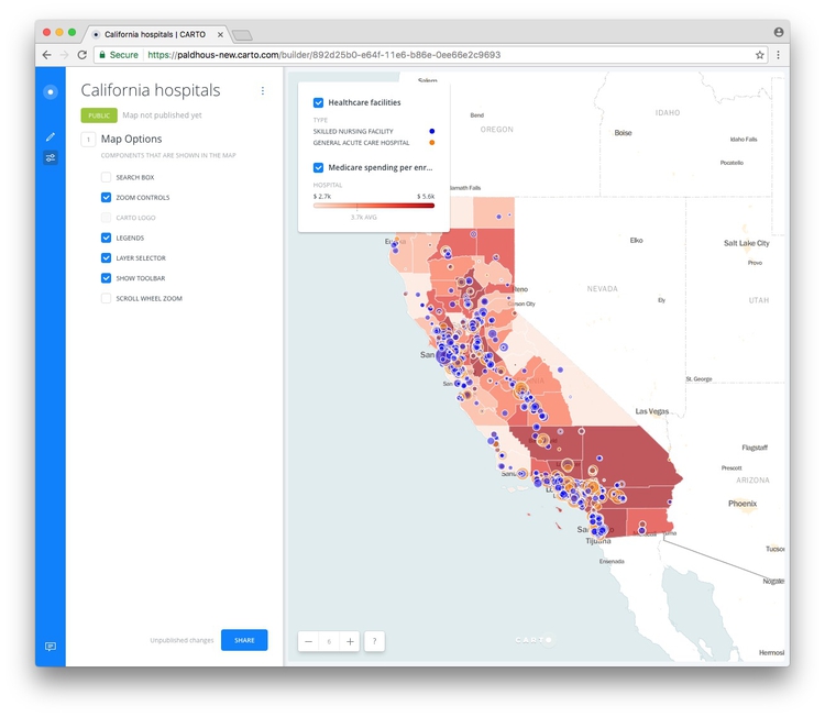
I strongly recommend disabling the SCROLL WHEEL ZOOM which will otherwise cause the map to zoom unintentionally when someone scrolls down a web page in which the map is embedded.
Having finished working on the map, click the SHARE button. This will call up the following options:
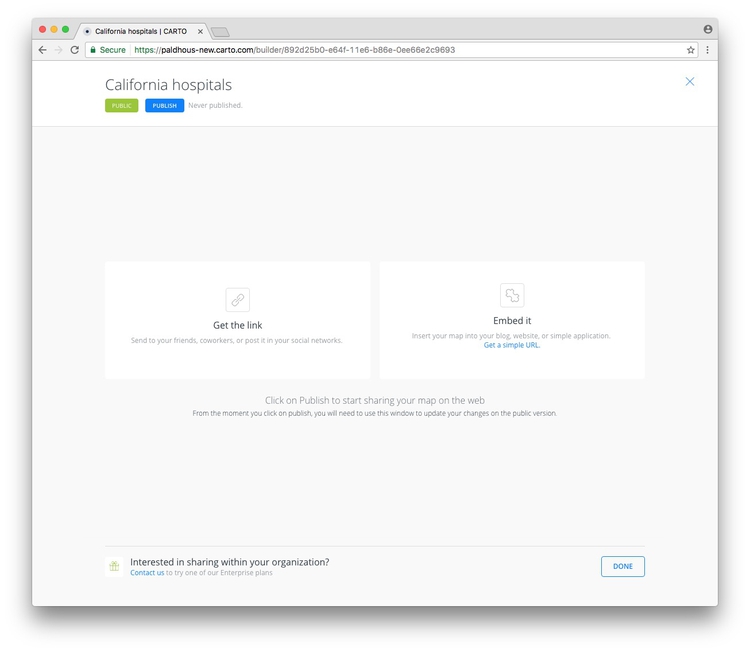
Click PUBLISH, than copy the code the code from Embed it to obtain an iframe which will allow you to embed the map on any web page, in the following format:
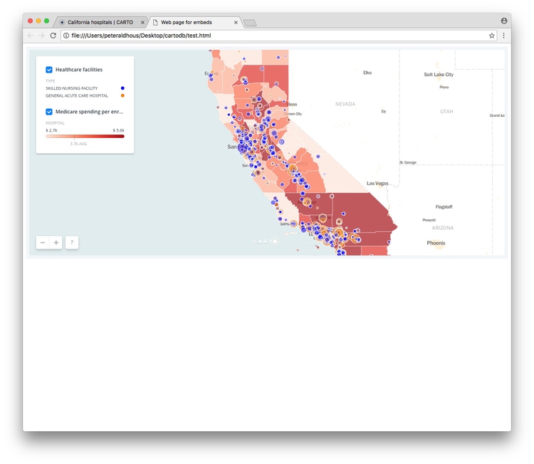
<iframe width="100%" height="520" frameborder="0" src="https://paldhous-new.carto.com/builder/f78e539e-e109-11e6-9f95-0e233c30368f/embed" allowfullscreen webkitallowfullscreen mozallowfullscreen oallowfullscreen msallowfullscreen></iframe></iframe>
(Note that you can edit the dimensions of the iframe — here set at 100% of the width of the div in which it appears — and 520 pixels high) as required.)
Open the file test.html in your text editor, paste the iframe code between the <body> </body> tags and save the file. Then open in a web browser to see the completed map:
Further reading/resources
The Map Academy
A series of exercies in Carto, organized by difficulty.